
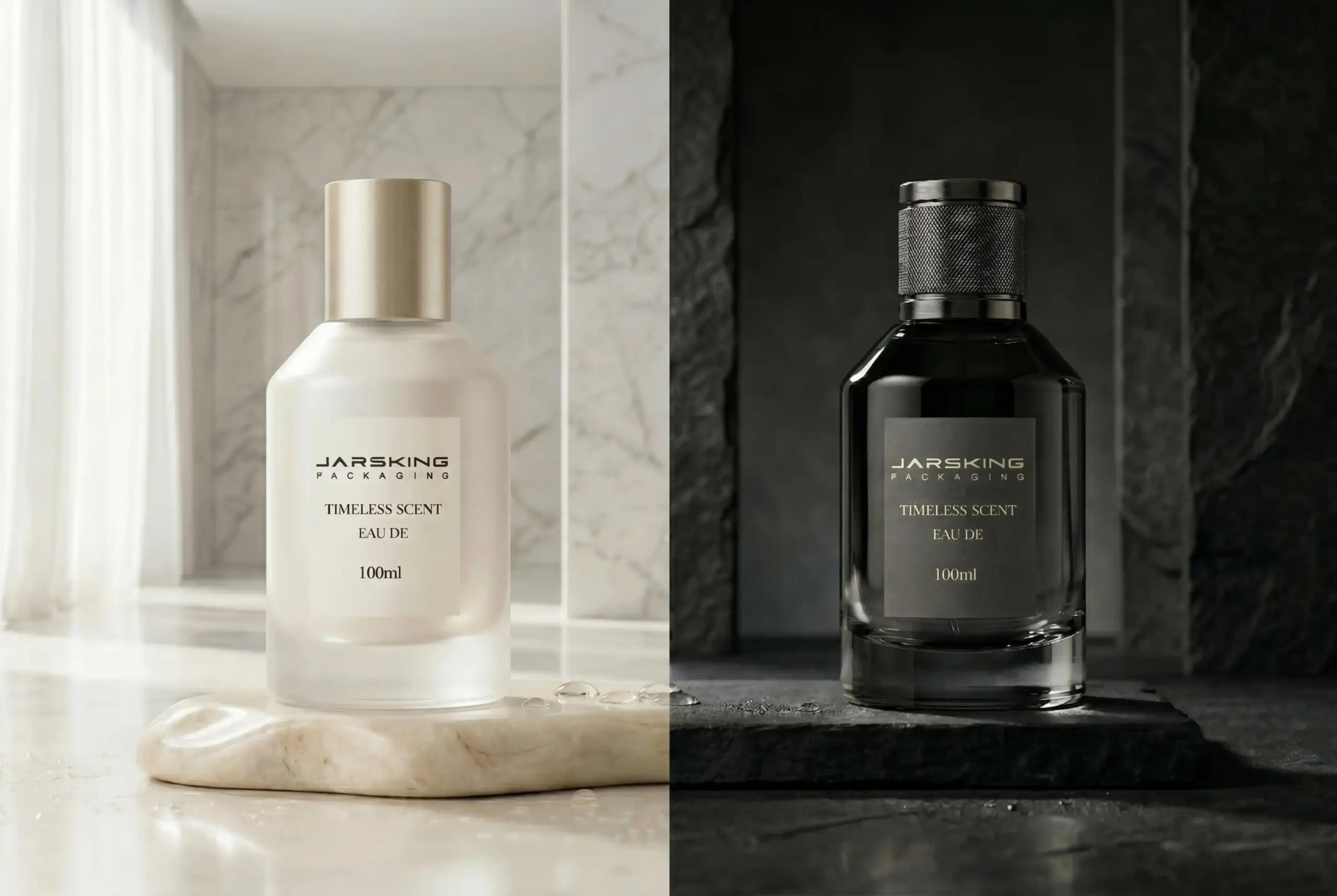


1. Introduction: Two Markets, One Shared Commercial Urgency
There is something quietly remarkable happening in the fragrance world right now. A category that for generations was shaped almost entirely by the ateliers of Paris and the glass factories of Murano is increasingly being reinvented by two very different forces: the commercial intensity of the American market, and the cultural electricity of South Korea. These are not the places most people would have predicted. But if you spend any time watching how fragrance is discovered, shared, and purchased today, it becomes obvious why they matter so much.
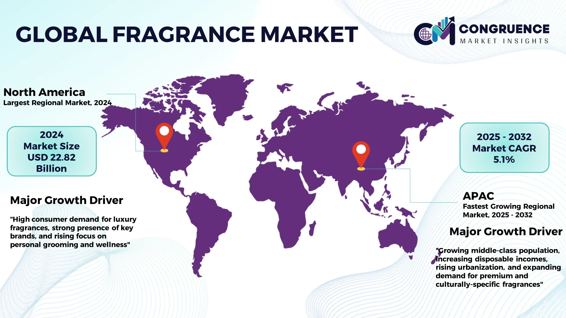
The global fragrance market is expected to reach USD 88.7 billion in 2026 and grow at a CAGR of 6.5% into the early 2030s, with online channels projected to account for the highest share of fragrance sales in 2026 — driven by social media, personalized digital recommendations, and the sheer purchasing power of younger consumers who grew up shopping on screens. In that world, the rules have changed. The bottle that wins is no longer necessarily the most beautiful one in the traditional sense. It is the one that earns recognition in a thumbnail, stops a scroll, holds its identity across a product line, and still feels wonderful in the hand when it finally arrives at the door.
The United States and South Korea each have a distinct answer to that challenge — and both answers are worth understanding deeply.
The U.S. brings commercial discipline. It is a market that has always asked hard questions of its packaging: Does it stand out? Does it build the brand? Does it work on shelf and on screen? Does it hold up across a product family without losing coherence? American fragrance packaging culture has been shaped by those demands over decades, and the result is one of the most strategically sophisticated design traditions anywhere in the world — even if it does not always get credit for it.
South Korea brings cultural fluency and genuine design joy. Korean fragrance exports grew 40% in 2024, carried forward by the same wave of global enthusiasm that has already transformed how the world thinks about skincare, makeup, and beauty packaging. K-beauty brands have expanded their presence in major international retailers including Ulta in the U.S. and Boots in the UK. South Korean packaging designers understand something deep about how a younger generation of consumers relates to objects: not as status symbols or heirlooms, but as everyday companions — things that belong in a flat lay, look good on a bathroom shelf, and make an ordinary Tuesday feel a little more intentional.
Together, these two markets offer fragrance brands and packaging developers something genuinely valuable: a complete commercial design framework built for the world as it actually is right now.
2. Part One: The United States — Brand Identity, Shelf Impact, and Modern Nostalgia
Why the U.S. Market Has So Much to Teach
People sometimes underestimate the United States as a design influence in fragrance. The prestige conversation tends to start in France and pass through Italy on its way around the world. But that framing misses something important. The U.S. is not where fragrance goes to become beautiful; it is where fragrance goes to become successful. And in a globally connected market, knowing how to make a bottle succeed commercially is just as valuable as knowing how to make it look magnificent.
What makes the U.S. market so instructive is its sheer demand on packaging. A bottle entering the American market has to earn its place in multiple arenas at once: on a department store shelf where dozens of competitors are lined up beside it; in a product image on a brand’s website; in a creator’s unboxing video on YouTube; in a six-second clip on a social feed; in a gift bag on a holiday table. Each of those environments rewards something slightly different, and the bottles that succeed are the ones whose design is coherent and confident enough to hold up across all of them.
This is why American fragrance packaging trends are so relevant for brands that genuinely want their bottles to work — not just to look good in a concept presentation but to perform in the real commercial world. And it is also why suppliers who understand this market tend to become genuinely valuable partners to their clients, not just vendors who fabricate to specification.
Trend 1: Brand Identity — The Decision That Everything Else Follows
If there is one thing the American fragrance market has taught the packaging world over the past two decades, it is this: identity comes first. Not aesthetics first. Not trend first. Identity first.
In a crowded market where a consumer might scroll past thirty fragrances before one earns a second glance, the bottle that wins is the one that looks like something specific — not just a nice glass container, but a clear statement about a particular brand world. That might mean a silhouette so distinctive it functions almost as a three-dimensional logo. It might mean a color system so strongly owned that a competitor would look like a copycat using it. It might mean a cap shape, a hardware detail, or a label format that becomes a recognizable signature across an entire product family.
What it does not require is loudness or complexity. Some of the most identity-strong fragrance bottles in the U.S. market are relatively clean and architecturally simple. The point is not decoration — it is decisiveness. Every design choice, from the base weight to the pump collar finish, should feel like it was made for a reason, in service of a consistent vision.
This matters more than ever because so many purchase journeys now begin with a digital encounter rather than a physical one. A consumer might see a bottle as a lifestyle reel, a creator review, or a single product image before they ever touch it in a store. If the packaging does not have strong, ownable identity, it disappears the moment the screen moves on. And no amount of beautiful copywriting can fully compensate for a bottle that fails to hold visual memory.
For packaging manufacturers, this trend has changed the nature of the best supplier relationships. The most useful development partners are not just fabricators — they are early-stage collaborators who understand that they are helping build a visual brand asset, and who bring that understanding into the room from the first conversation.
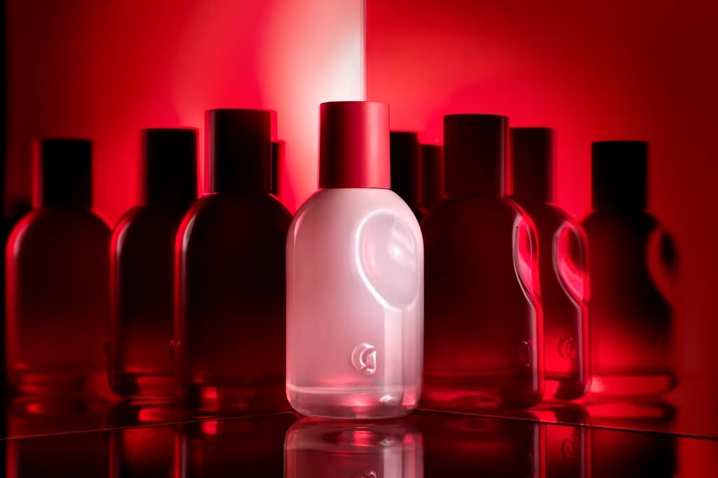
Trend 2: Modern Nostalgia — Familiarity With a Contemporary Soul
There is something deeply human about nostalgia. We are drawn to things that feel rooted — that carry a sense of history, of having existed before the moment we encountered them. In fragrance especially, which is one of the most memory-linked of all consumer categories, that pull toward the familiar is powerful and commercially real.
But the most interesting thing happening in the U.S. fragrance market right now is not nostalgia in its simple form. It is what brands and designers are calling modern nostalgia — a more nuanced approach that borrows the emotional warmth of heritage packaging without recreating it literally. Think of the rounded shoulders of a classic apothecary bottle, the quiet authority of a serif typeface, the slightly warm tint of vintage glass, the reassuring weight of an old prestige-era cap — translated into a bottle that feels contemporary, resolved, and cleanly made. The result is packaging that carries genuine emotional resonance without looking like it belongs in a period drama.
This works because consumers — especially in the American market, where niche fragrance and independent perfumery have grown enormously — are often looking for products that feel like they have a story. Even when a brand is new, packaging that feels architecturally grounded can project a kind of trustworthiness that overtly trendy design struggles to achieve. It says: this was thought through. This is not a moment; it is a point of view.
Modern nostalgia also travels beautifully in digital content, which is a genuine commercial advantage. It gives creators and social shoppers a ready-made vocabulary — timeless, old-money, quiet luxury, archive-inspired — that maps naturally onto lifestyle and fashion content ecosystems. In a world where a fragrance can find its audience through organic content as much as paid media, packaging that generates its own storytelling potential is worth more than it might appear on a development budget spreadsheet.
Trend 3: The Shelf-and-Screen Problem
Here is the challenge that U.S. fragrance designers are working through right now, and it is one of the most technically interesting problems in commercial packaging: a bottle has to perform in two completely different visual environments simultaneously. On a physical retail shelf, it needs to hold its presence at distance — to be readable, recognizable, and confident among a row of competitors under fluorescent lighting. On a screen, it needs to work in a still image, in a video frame, in a six-second Reel, and in the tiny format of a product thumbnail. These are genuinely different demands, and they do not always point to the same design decisions.
Overly intricate surface decoration can look rich and intentional in person and become muddy or illegible in a small digital image. A strong flat color that dominates a product photo can recede or disappear in the mixed visual environment of a shelf display. A bottle that feels luxuriously weighty in the hand can look heavy and uninviting in a campaign shot. The designers and suppliers who navigate this well are the ones who keep both environments in mind from the earliest design decisions — not as a constraint that limits creativity, but as a performance brief that actually makes the design stronger.
Clean, confident forms tend to resolve this tension most gracefully. A well-proportioned silhouette with a clear hierarchy — one strong element that leads the design, with supporting elements that reinforce rather than compete — reads well at any scale and in almost any context. The real creative challenge is making simplicity feel ownable rather than generic; making a bottle that is clean and un-fussy look like it could only belong to one brand. When that works, the results are quietly extraordinary.
For packaging suppliers, this dual-channel reality opens up a genuinely valuable advisory role. Decoration choices — frosting, gradient lacquers, dense coatings, hot stamps, matte-versus-gloss combinations — behave differently under camera conditions than under retail lighting. The suppliers who understand those differences, and who bring that knowledge into client conversations proactively, consistently add more value than those who simply execute a decoration specification after the design has been finalized elsewhere.
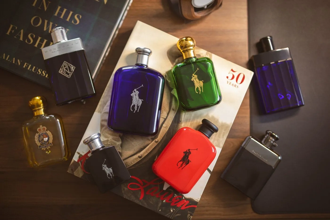
Trend 4: Premium Convenience — Luxury That Fits Real Life
Somewhere along the way, convenience became a luxury value in the American fragrance market. That might sound counterintuitive — luxury is supposed to be about elevation, not ease — but it reflects a genuine shift in how prestige consumers think about the products they love.
Modern fragrance buyers, particularly in the prestige and niche segments, want their favorite bottles to travel well, close securely, spray reliably, and refill without feeling like a technical challenge. They want packaging that fits into the rhythm of their actual lives, not just the version of their lives they might imagine when looking at a campaign image. Magnetic caps, dependable pump mechanisms, ergonomically thoughtful proportions, and travel-friendly formats are all increasingly part of what premium means to these consumers — not alternatives to luxury, but expressions of it.
Refillability is the most structurally significant expression of this shift. The momentum in the prestige fragrance segment toward refill-compatible packaging is real and growing, driven by a combination of consumer environmental awareness and a simple desire to hold onto a beautiful bottle. The fragrance packaging market’s projected growth from USD 2.54 billion in 2026 to USD 3.80 billion by 2035 is partly powered by this kind of innovation — the development of bottle architectures and closure systems that support a more circular product lifecycle without diminishing the luxury character of the hero object.
For manufacturers, the key insight here is that refillability works best when it is a design intention from the very beginning, not a feature retrofitted onto an existing design. A bottle conceived as a long-life object from the start — given the right closure tolerances, the right structural weight, the right component durability — feels entirely different from one that has had a refill system apologetically added to it later. The former is genuinely desirable. The latter often just creates friction.
3. Part Two: South Korea — Youthful Minimalism, Trend Agility, and Digital-First Packaging
South Korea and the Joy of Getting It Right Fast
If the American market teaches us about commercial discipline, South Korea teaches us about joy — specifically, the joy of packaging that feels genuinely current, visually alive, and designed for the world that consumers are actually living in.
K-beauty has already rewritten the rules of global beauty packaging. The same intelligence that transformed how the world thinks about skincare texture, freshness, and visual clarity is now moving into fragrance with real momentum. Korean fragrance exports grew 40% in 2024. The South Korean cosmetic packaging market is forecast to grow from USD 2.59 billion in 2025 to USD 3.65 billion by 2035. These are not small numbers. They reflect a design culture that has found a genuine global audience — and the reason it has found that audience is not just Korean cultural influence broadly, but the specific and hard-won ability of Korean designers and manufacturers to turn cultural insight into commercially excellent packaging very, very quickly.
What South Korea brings to fragrance bottle design is something that is honestly a bit difficult to manufacture if you have not grown up with it: a deep, intuitive understanding of how younger consumers relate to objects. Not as investments or status symbols or heirlooms — but as companions. Things that sit on your shelf and make you feel good. Things that look beautiful in a photo without trying too hard. Things that feel like an expression of who you are today, not who you aspire to be in some imagined future version of yourself.
That sensibility, translated into packaging, produces something genuinely distinctive. And the rest of the world is paying close attention.
Trend 1: Youthful Minimalism — Warm, Clean, and a Little Bit Lovely
The clearest visual signature of South Korean fragrance packaging is what the industry has started calling youthful minimalism — and it is worth dwelling on why that combination of words is the right one.
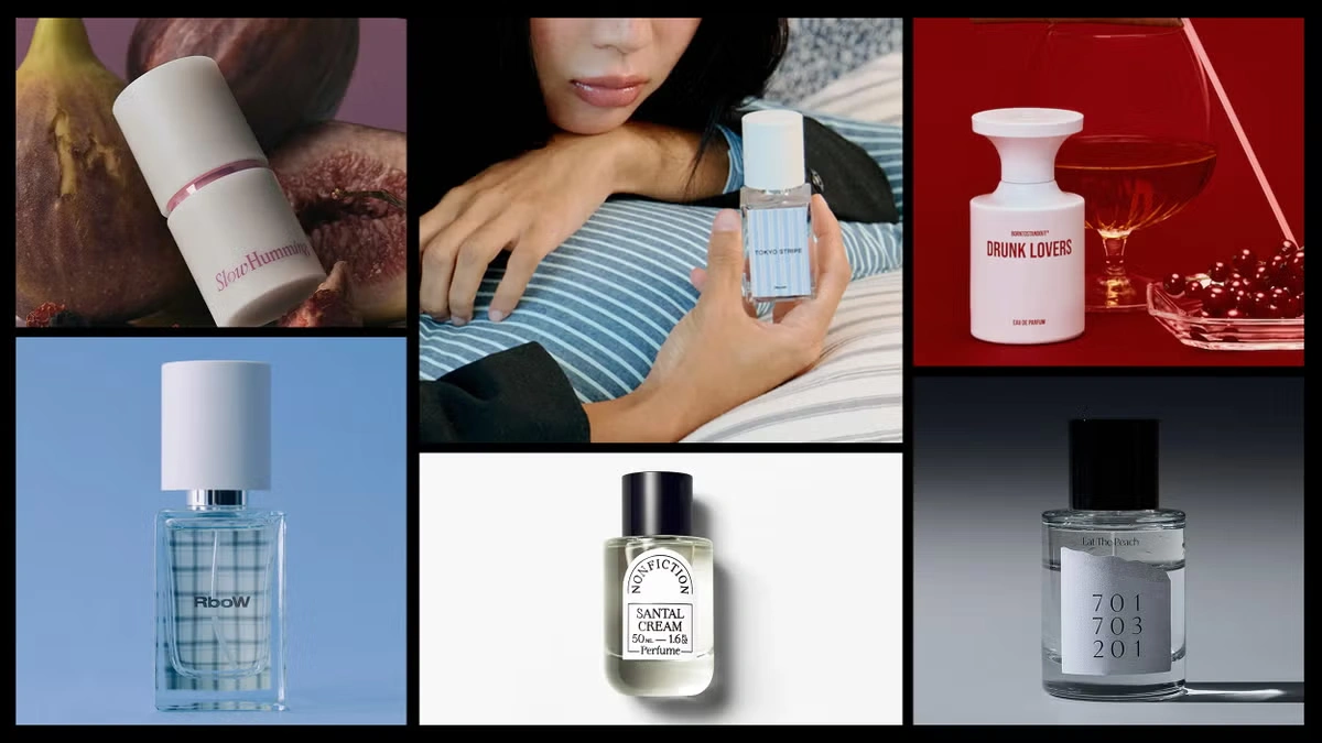
It is minimalist in the sense that it is clean, uncluttered, and visually resolved. There is no excess decoration, no competing elements pulling against each other, no straining for attention. But it is emphatically youthful in a way that distinguishes it from, say, the philosophical restraint of Japanese packaging or the cool-handed confidence of Scandinavian design. Korean minimalism has warmth in it. It has rounded corners where Japanese packaging might use crisp edges. It uses soft, translucent color tints rather than the sterner palette of European minimalism. Its proportions feel personal and approachable rather than monumental and distant.
The effect is packaging that consumers — especially Gen Z and younger millennial shoppers — genuinely want to live with. Not displayed reverentially behind glass, but sitting on the bathroom shelf next to a succulent, appearing in a vanity flat lay, or getting pulled out of a tote bag without any self-consciousness. The bottle becomes part of someone’s everyday aesthetic rather than a luxury object they interact with only on special occasions.
From a manufacturing perspective, this kind of gentle simplicity demands real skill. There is nowhere to hide on a minimalist pack. Uneven coatings, slightly misaligned labels, imprecise cap fits, or inconsistencies in glass clarity are immediately obvious against a clean backdrop. Youthful minimalism looks effortless; achieving it consistently is anything but.
Trend 2: Designed for the Screen First
Here is something that South Korean packaging designers understood before most of their global counterparts: the primary space where a fragrance bottle needs to earn attention is a phone screen. Not a shelf. Not a boutique cabinet. A phone screen, viewed while someone is scrolling, probably with one thumb, probably while doing something else at the same time.
That insight sounds simple, but it has profound design implications. If your bottle needs to capture someone’s attention in that context — in a fraction of a second, at small scale, competing with thousands of other images — then every design decision needs to be evaluated through that lens first. How does this surface treatment behave in a photograph? Does this cap create enough visual contrast to define the bottle’s silhouette at thumbnail size? Does this color read as the same color it actually is under camera lighting? Does the bottle look equally appealing from all four sides, since there is no guarantee which angle a creator will use?
South Korean brands answer these questions with specific, practically grounded design choices. Soft translucency catches light in photographs in a way that creates genuine luminosity — something heavier, more opaque materials often cannot match. Distinctive cap contrast gives the bottle clear visual structure that holds up at any scale. Gradient tints and gently graduated color effects photograph richly and adapt well to different lighting conditions. Compact sculptural forms with no single dominant axis look composed and intentional from multiple angles.
The global influence of this approach is already visible. As one 2026 industry analysis put it, K-beauty’s fast innovation cycle and creative visual intelligence is genuinely pushing U.S. beauty brands to reconsider their approach to packaging launches — and that pressure has arrived in fragrance as decisively as it arrived in skincare. For any fragrance brand whose customers primarily discover new products through digital channels, learning from how Korean designers think about visual performance is not optional — it is urgent.
Trend 3: Staying Current Without Losing Yourself
There is a tension at the heart of brand management that every packaging designer eventually has to reckon with: the need to stay culturally relevant and the need to maintain a consistent identity. Move too slowly and your packaging starts to feel stale in a trend-driven market. Change too quickly and you lose the visual coherence that drives recognition and trust. Most brands handle this tension awkwardly, lurching between long periods of stasis and jarring redesigns that leave loyal customers confused.
South Korean fragrance brands have developed a genuinely elegant structural answer to this problem. They build their packaging around a stable core — a bottle form, a dimensional system, a component family — that functions as the unchanging backbone of the brand’s visual identity. Then they allow surface elements to evolve: color systems refresh seasonally, limited-edition finishes respond to cultural moments, collaborative aesthetics bring in external creative energy, and special variations keep the brand feeling alive and engaged without destabilizing the underlying architecture.
The bottle stays the same. The story it tells can change as often as the brand’s relationship with its audience demands.
This approach has practical supply chain implications that are worth taking seriously. It creates genuine demand for flexible decoration options — color-shift coatings, varied hot-stamp choices, differentiated label systems — that can be applied to a stable base without requiring a full tooling investment each time. It requires manageable minimum order quantities for surface variations, so that seasonal drops and collaborative editions are commercially viable. And it rewards suppliers who understand the concept of a packaging family — a bottle architecture designed from the outset to absorb variation — rather than those who think purely in terms of individual SKUs.
For packaging developers, this trend is also an invitation to reframe the supplier relationship. The brands that value fast, coherent iteration are exactly the kind of clients who benefit most from a long-term partnership with a supplier who knows their base architecture inside out and can move quickly when a new variation is needed.
Trend 4: Everyday Luxury — Perfume for Actual Life
One of the most quietly radical things South Korean fragrance culture is doing right now is gently dismantling the idea that perfume needs to be formal. Traditional luxury fragrance positioning has always carried a certain solemnity — the implication that this is a special object, for special occasions, to be treated with a degree of ceremony. South Korea is proposing something warmer and, frankly, more livable: that perfume can be part of everyday self-care, a daily mood ritual, a companion to an ordinary morning rather than a marker of an exceptional evening.
This shift in positioning has a direct and practical effect on what good packaging looks like. A bottle designed for daily use has different requirements from one designed for special occasions. It should feel comfortable and natural in the hand. It should sit easily on a bathroom shelf or a desk. It should be sized and proportioned for routine handling, not for reverent display. And it should feel meaningfully elevated above mass-market alternatives — genuinely premium in its materials, its finish, and its attention to detail — without the formal distance that traditional luxury codes sometimes create between an object and the person who owns it.
This “soft premium” positioning opens up fragrance packaging in ways that matter beyond aesthetics. It connects design decisions to the daily texture of people’s lives — to self-care habits, to personal space curation, to the growing sense that fragrance is as much a wellness practice as a fashion statement. In content terms, it is precisely the kind of grounded, behavior-connected perspective that earns genuine engagement from readers — and increasingly, the kind of substance that search engines and AI answer systems reward over more superficial trend coverage.
4. The Shared Lesson: Visual Performance Is Table Stakes Now
Step back from the individual trends in each market, and a single clear conclusion emerges. In both the United States and South Korea — two markets approaching the same challenge from completely different cultural starting points — the defining commercial reality of fragrance packaging today is that visual performance is no longer a differentiating advantage. It is a baseline requirement.
Brands that genuinely understand this design accordingly. They ask hard questions of their bottles before anything goes to production: Does it read at thumbnail scale? Does it hold its identity across a product family? Does it feel as good as it looks when someone picks it up? Will it still feel relevant in three years? They invest their development resources in the decisions that have the greatest downstream commercial impact — not always the most visually dramatic ones, but the ones that will keep paying returns.
The most commercially valuable packaging suppliers are the ones who can walk alongside brands through those questions, not just execute the answers. The shift from fabricator to genuine development partner is visible in both markets, and it reflects something real: in a world where packaging has to perform across so many environments simultaneously, the brands that get it right are rarely the ones working from a brief handed over the wall. They are the ones in a genuine conversation with people who understand both the design and the commercial system it needs to serve.
The fragrance packaging market will grow from USD 2.54 billion in 2026 to USD 3.80 billion by 2035. The brands and suppliers that build this kind of collaborative, commercially grounded capability now are the ones best positioned to grow with it.
5. Conclusion: Two Ways of Caring About the Same Thing
Perfume bottle design trends in the United States are ultimately about a kind of rigorous love for commercial clarity — the conviction that a bottle should know exactly what it is, who it is for, and how to make that clear in the first three seconds of any encounter. Brand identity as foundation. Nostalgia as emotional warmth. Dual-channel performance as non-negotiable. Convenience and refillability as genuine expressions of care for the person who will actually live with the product.
South Korean perfume bottle design trends are about a different but equally genuine form of care — the desire to create objects that feel culturally alive, visually joyful, and perfectly suited to the way younger consumers actually experience beauty today. Youthful minimalism as an aesthetic. Digital fluency as a design criterion. Fast, coherent iteration as a competitive capability. Soft premium positioning as an invitation rather than a barrier.
Neither tradition has all the answers on its own. But used together, they offer fragrance brands a remarkably complete picture of what commercially successful, emotionally resonant packaging looks like in the decade we are currently living through — and a clear framework for building it.