1. Introduction: Three Design Philosophies, One Shared Standard of Excellence
The global perfume bottle design landscape is shaped by a handful of countries whose contributions go far beyond geography. Italy, Japan, and Spain each bring a distinct philosophy to fragrance packaging — one defined by expressive artistry, another by disciplined restraint, and a third by the effortless warmth of the Mediterranean. Together, they represent three of the most commercially relevant and creatively instructive design traditions available to beauty brands today.
manufacturing capability with a deep cultural inheritance of art, fashion, and decorative craft. The result is a design language that feels sensual, emotionally resonant, and visually fluid — qualities that French packaging, for example, often subordinates to classical restraint. Italian perfume bottle design trends are driven not just by the fragrance sector but by fashion, furniture, architecture, and the decorative arts, all of which feed into a shared understanding of what beautiful objects look and feel like.
Japan occupies an entirely different register, but one of equal importance. Japanese perfume bottle design trends emphasize precision, usability, and emotional calm. In a fragrance category crowded with decoration and spectacle, Japan offers a counterproposal: luxury built through control, proportion, and sensory balance. As more consumers gravitate toward thoughtful design and intentional minimalism, Japanese packaging language has become a global reference point for niche fragrance, clean beauty, and premium lifestyle brands.
Spain sits between these two poles. It is not always the loudest voice in the international design conversation, but it is one of the most practically useful. Spanish fragrance packaging trends reflect the country’s commercial reality as a major player in fragrance manufacturing and lifestyle beauty. Bottles developed within this tradition combine elegance with accessibility, warmth with practicality, and premium aspiration with the scalability that real-world brand management demands.
For packaging developers, beauty brand managers, and fragrance founders, understanding these three traditions is not merely an exercise in cultural appreciation. Each offers a strategic model for positioning, differentiation, and product development. This article examines each design culture in depth, traces its dominant trends, and draws out practical implications for brands building or refining their fragrance packaging strategies.
2. Part One: Italy — Artistic Glass, Fashion Sensibility, and Expressive Luxury
Italy’s Role in Luxury Perfume Packaging
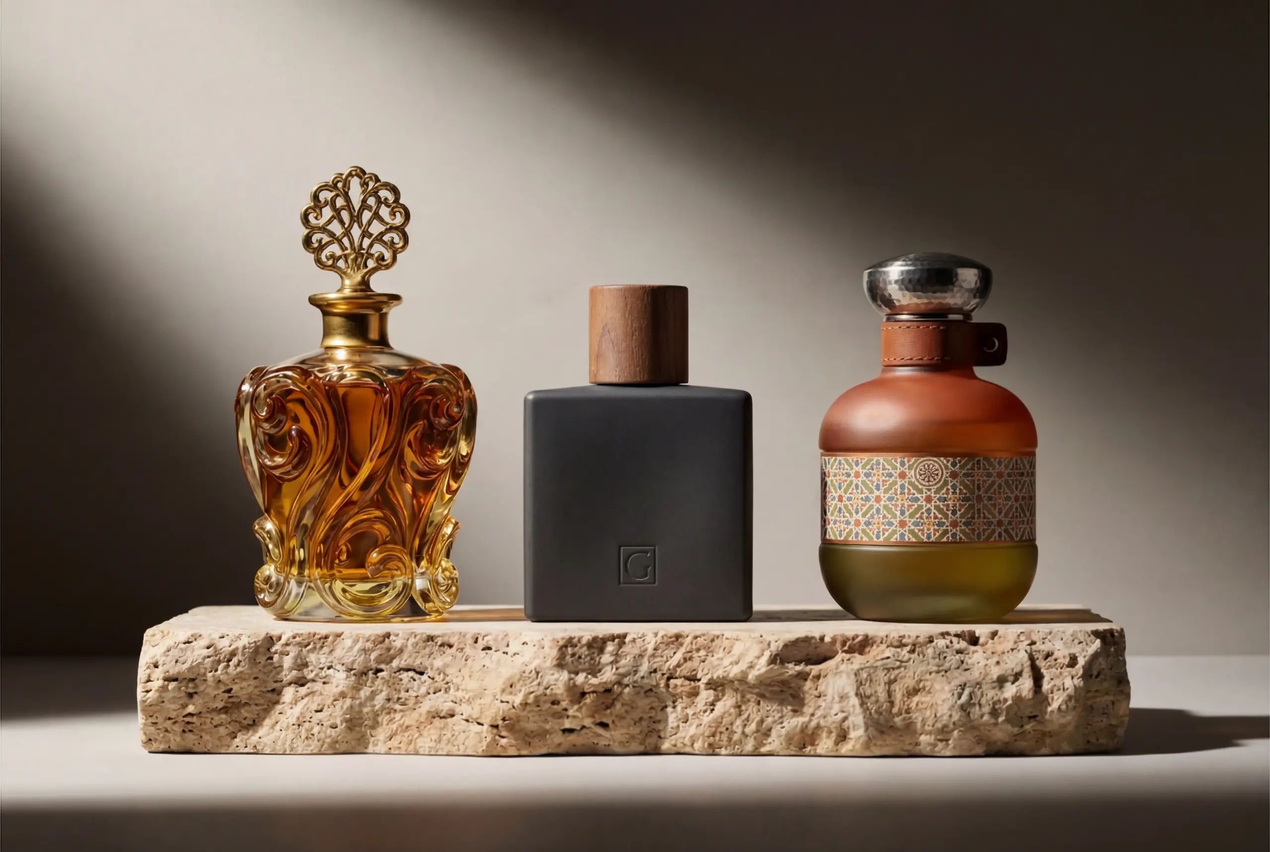
Italy’s influence on perfume bottle design begins in the glass itself. The Murano tradition — centuries of master glassblowing on the Venetian lagoon — has produced an understanding of glass as a medium for artistic expression that no other country has replicated at scale. Italian manufacturers and designers do not treat the bottle as a neutral vessel. They treat it as an object with a visual and tactile life of its own, one that should communicate mood, movement, and cultural sophistication before the fragrance is even encountered.
This inheritance has commercial consequences. Queries such as luxury perfume bottle design, premium glass perfume bottle, artistic fragrance packaging, and Italian-inspired cosmetic packaging all intersect with this theme, attracting both inspiration-driven consumers and supplier-intent professionals. For fragrance brands launching at the premium end of the market, Italian design references carry a weight of credibility that is difficult to achieve through visual styling alone.
Italian perfume bottle design is also shaped by a cross-disciplinary creative culture. Fashion, interior design, ceramic art, sculpture, and architectural decoration all contribute to how Italian luxury is perceived and produced. In packaging, this means bottles are often designed with the same holistic attention to line, movement, material tension, and balance between function and beauty that characterizes Italian output across industries. The best Italian-inspired bottles feel not just well-designed but resolved — as if every decision was made with full awareness of every other.
Trend 1: Artistic Glass and Sculptural Silhouettes
One of the defining perfume bottle design trends in Italy is the treatment of glass as a sculptural medium. Italian luxury packaging rarely regards the bottle as a passive container. Instead, the bottle is shaped with deliberate visual rhythm — curves that suggest movement, shoulders with intentional weight, and transitions between planes that feel dramatic rather than mechanical. Even relatively simple forms are often conceived with a strong artistic sensibility.
This matters commercially because fragrance is an emotional purchase. Consumers buy perfume for identity, pleasure, memory, and self-expression. An expressive, visually confident bottle supports that emotional journey from the first moment of contact — on a shelf, in a product image, or in someone else’s hands. Italian-influenced bottles can communicate sensuality, glamour, softness, or fashion energy before a single spray is applied. In retail environments where visual differentiation determines whether a product is reached for or passed over, sculptural design does real commercial work.
From a development perspective, sculptural forms introduce genuine technical challenges. Unusual geometry affects mold design, glass distribution, structural stability, spray functionality, and compatibility with outer packaging. Successful execution demands close coordination between industrial design, technical drawing, and production engineering. For custom perfume bottle manufacturers, Italian-inspired concepts frequently require stronger pre-production support and more intensive prototyping than conventional forms.
The guiding principle for brands choosing this direction is that expressiveness must serve the design, not overwhelm it. The finest Italian-style bottles feel resolved. Their asymmetry, when present, reads as intentional. Their curves carry purpose. Artistic quality comes from proportion and confidence — not visual clutter or decoration for its own sake. A bottle that looks complicated has not necessarily achieved what a bottle that looks beautiful has.
Trend 2: Fashion-Driven Luxury and Emotional Styling
Italian perfume packaging is deeply shaped by the fashion industry. This is visible in the way bottles communicate mood, silhouette, and material tension — in the same way that Italian fashion balances sensuality with precision, combining clean structural foundations with expressive, often unexpected, details. A bottle may be architecturally simple but elevated through a dramatic cap form, a deep color treatment, a distinctive shoulder curve, or a hardware choice that signals couture rather than cosmetics.
Fashion-led design performs especially well for brands targeting aspirational consumers, where the packaging becomes part of a lifestyle image. It tells a story about how the fragrance should feel, where it belongs, and who it is designed for. In digital commerce, this emotional shorthand is disproportionately valuable. When consumers cannot smell through a screen, visual identity must carry the full weight of differentiation. Italian-style packaging tends to be well-suited to this environment because it communicates both polish and personality — a combination that photographs well and reads clearly at small scale.
This trend also supports premiumization strategies. When a fragrance bottle visually belongs to the world of high fashion or collectible design objects, the perceived value of the product rises accordingly. That makes higher price points easier to justify, particularly when the visual story is supported by elevated finishing — lacquers, metal collars, weight, and tactile surface quality.
For packaging suppliers, understanding fashion influence means understanding that it extends well beyond color choice. It encompasses line, proportion, hardware feel, and a coherent styling sensibility that runs through every component. Cap shape, pump collar finish, lacquer texture, printed typography, and even the interaction of the primary bottle with its carton all contribute to whether the overall design reads as fashion-inflected or merely decorative.
Trend 3: Rich Color, Material Contrast, and Decorative Tension
A further defining tendency in Italian perfume bottle design is openness to richer palettes and visible contrast between materials. Where many global design schools favor restraint in color, Italian-influenced bottles are more willing to work with smoky tones, jewel-like lacquers, gradient effects, warm neutrals, frosted finishes, and contrasting cap textures. These combinations create stronger emotional signatures without necessarily pushing the design into excess.
Material contrast is a particularly powerful tool in premium fragrance packaging because it creates visual depth. A smooth glass body against a textured cap, a matte lacquer beside a polished metal collar, or a translucent body offset by an opaque accessory all make the product feel more considered — more built, more deliberate. Italian design tends to be highly skilled at generating this sense of orchestrated tension while maintaining overall visual harmony.
The challenge is calibration. When too many color and texture statements compete simultaneously, the result feels unbalanced. Italian luxury works because the contrast feels controlled: one element leads the visual story, and the others reinforce it rather than competing with it. The bottle knows what it is trying to say, and every component serves that central communication.
For brands developing packaging in this direction, this principle offers practical design guidance. The goal is not to add richness through accumulation, but through selection. Choose one strong material statement, build the complementary elements around it, and resist the temptation to layer further detail onto an already resolved design.
Trend 4: Refillable Premium Bottles with Lasting Display Value
Italy is also influential in the growing move toward refillable premium perfume bottles — particularly for brands that want to integrate sustainability without sacrificing decorative appeal. Italian-inspired solutions tend to treat the bottle as a long-life object. The fragrance may be replenished, but the pack is designed to remain worthy of display on a dressing table or vanity shelf. This mindset aligns naturally with categories where gifting, home display, and collecting behavior are significant purchase drivers.
Designing for refillability changes the performance requirements of the bottle. It must feel durable rather than disposable. The filling and closing system must support repeat use without mechanical degradation. The cap and pump interaction must remain secure over many cycles. The overall product architecture must make logical sense as a permanent object — not something to be discarded after a single use. Italy’s design culture, with its long tradition of beautiful functional objects, is well-positioned to meet this challenge.
For manufacturers, refillability opens up new strategic conversations: neck standards, closure systems, insert solutions, and after-sales packaging all become relevant design parameters. The key insight from Italian packaging development is that sustainability and luxury aesthetics are not in tension when the design intent is clear from the beginning. Brands that define the refillable bottle as a design centerpiece — rather than as a sustainability afterthought — consistently achieve better results on both dimensions.
What Perfume Brands Can Learn from Italy
Italy teaches fragrance brands that emotional design has measurable commercial value. A bottle that looks expressive, considered, and visually distinctive can attract attention at shelf, support brand storytelling, improve social-media performance, and strengthen price positioning. These outcomes do not require the most expensive components or the most complex forms — they require commitment to design intelligence and production discipline.
At the same time, Italian-style packaging is not solely a visual achievement. It depends on technical execution. Glass quality, decoration precision, cap engineering, and production-line compatibility all determine whether the design holds up at scale. Brands that pursue the aesthetic without investing in the underlying development process often end up with packaging that works in concept but fails in production. The Italian approach works because it refuses to separate the beautiful from the buildable.
3. Part Two: Japan — Precision, Calm, and Understated Luxury
Why Japan Matters in Perfume Bottle Design
Japan occupies a distinctive and increasingly influential position in global beauty and luxury culture. It is rarely the loudest voice in fragrance packaging, but it may be the most refined. Japanese perfume bottle design trends consistently emphasize restraint, precision, usability, and emotional calm — qualities that position Japan as an essential reference point in a fragrance market increasingly drawn to thoughtful, intentional design.
This approach resonates with a broad and growing segment of fragrance consumers. Niche fragrance buyers, clean beauty enthusiasts, gender-fluid lifestyle brands, and premium minimalist labels all find highly relevant precedents in Japanese design. As the fragrance industry matures, and as consumers become more sophisticated about packaging as both an aesthetic and an ethical object, Japan’s design language gains commercial traction that extends well beyond East Asia.
In packaging terms, Japanese influence appears through quiet geometry, visual lightness, subtle tactile detail, and elegantly functional components. Bottles feel resolved — stripped of unnecessary gesture, yet not stripped of warmth. Transparency, matte softness, carefully considered typography, and disciplined component matching are consistent markers. The overall result is a style that reads as sophisticated and contemporary without requiring spectacle.
Trend 1: Restraint as a Form of Luxury
Perhaps the most important idea in Japanese perfume bottle design is that restraint itself can be a luxury signal. Rather than competing through ornate decoration or complex visual layering, the bottle earns attention through conceptual clarity. The silhouette may be simple, but the proportions are exact. The typography may be small, but its placement is deliberate. The cap may appear modest, but the finish, weight, and fit communicate quality more precisely than any embossed logo.
This mode of luxury is powerful because it signals confidence. A brand that does not need to over-explain itself visually projects a particular kind of authority. For consumers who are increasingly fatigued by busy premium packaging — by the gold foiling, the layered ornamentation, the competitive noise of department store shelving — Japanese-influenced design can stand out precisely by refusing to compete on those terms. Quiet design, when executed with genuine skill, is commanding.
For manufacturers, restrained luxury imposes a higher quality threshold. On a minimalist pack, surface defects, uneven decoration, poor cap alignment, and inconsistent component finish are immediately visible. There is nowhere to hide imperfection behind complexity. Japanese-inspired bottles therefore demand production discipline, rigorous quality control, and a manufacturing partner willing to hold tight standards across the full component set.
Trend 2: Soft Transparency, Lightness, and Sensory Calm
Japanese bottle design frequently uses transparency as an emotional tool, not merely a material property. Clear glass, softly frosted surfaces, pale color tints, and muted coatings are deployed to create a feeling of purity, stillness, and visual air. Rather than generating contrast through bold juxtaposition, Japanese-influenced bottles typically seek tonal balance and visual quiet — a composed palette that does not demand attention but rewards it.
This aesthetic is especially well-suited to the fragrance-as-wellness positioning that is gaining significant commercial momentum. When perfume is marketed as part of a daily ritual, an emotional reset, or a moment of sensory intention, the bottle should support that story visually. A packaging design that feels calm and unhurried can reinforce the sensory promise of the fragrance itself, extending the brand experience before the product is even opened.
The critical qualification is that visual lightness must not be confused with material cheapness. High-quality Japanese-inspired packaging still requires excellent glass clarity, stable construction, and precisely finished accessories. The bottle can feel airy and unobtrusive while remaining entirely credible as a premium object. The difference lies in how the components are engineered, not in how much they cost to decorate.
Trend 3: Functionality and the Full User Experience
A defining and often underappreciated feature of Japanese perfume bottle design is its deep respect for functional performance. In Japanese design culture, a product that works beautifully is a product that is beautiful. Sprays should feel controlled. Caps should close with a satisfying, precise engagement. The bottle should be comfortable to hold, balanced in the hand, and intuitive to use in the context of a daily grooming routine. This functional commitment is inseparable from the aesthetic one.
In practical packaging terms, this often leads to cleaner handling surfaces, more carefully balanced dimensional proportions, and less decorative interference with core ergonomics. Components are engineered to perform consistently over time — not just to impress at first touch. The pump, the collar, the cap, and the glass body are treated as a system, each element designed in relation to the others.
For packaging suppliers, functional excellence is a powerful and differentiating content marketing theme. Articles and product descriptions that explain how great fragrance packaging integrates visual restraint with reliable user experience speak directly to a need that brand-side readers often find underserved. It is also genuinely SEO-relevant: professionals searching for minimalist perfume bottle design or luxury fragrance packaging functionality are frequently trying to solve real development problems.
Trend 4: Understated Differentiation for Premium Niche Brands
Japanese-inspired design offers premium niche fragrance brands one of the most effective available routes to differentiation through understatement. Rather than competing within the ornate visual vocabulary of legacy luxury houses — the heavy crystal, the gilded cap, the embossed crest — niche brands can build distinction through disciplined restraint. A bottle with clean lines, refined material presence, carefully edited typography, and excellent component quality can project intelligence, creative maturity, and modern trust.
This approach also performs well in AI-driven search and answer environments. Pages that clearly and practically explain minimalist premium packaging — what bottle shapes support calm design, what surface treatments preserve subtlety, how to make a simple bottle feel expensive, when to choose frosting versus coating versus clear glass — serve genuine user needs. They are the kind of content that earns reference in AI-generated answers precisely because they are practical, specific, and authoritative rather than broadly promotional.
For B2B packaging content, the most effective execution connects Japanese design values to actionable development decisions. Not just what these bottles look like, but how to build them well.
4. Part Three: Spain — Mediterranean Elegance, Lifestyle Fragrance, and Accessible Premium Design
Spain’s Quiet Strength in Fragrance Design
Spain may not lead the global conversation about perfume bottle design with the same frequency as France or Italy, but its contribution to the fragrance industry is substantial and strategically important. Spain is a significant manufacturing presence in European fragrance, and its brands occupy a commercially instructive position: stylish enough to compete in premium channels, accessible enough to scale across a broad retail landscape.
Perfume bottle design trends in Spain reflect this dual ambition. Spanish fragrance packaging combines visual elegance with practical accessibility, Mediterranean warmth with genuine usability, and premium aspiration with the manufacturing realism that actual brand management requires. The result is a design tradition that is not trying to be the most rarified in the room — but is consistently trying to be the most useful, the most coherent, and the most commercially viable.
For packaging developers and beauty brand managers, Spain is an underused reference point. It shows how fragrance packaging can look polished, giftable, and visually refined while remaining scalable across multiple channels and price points — a balance that is, in practice, extremely difficult to achieve and extremely valuable when it is.
Trend 1: Mediterranean Elegance Through Warm Simplicity
The most distinctive tendency in Spanish perfume bottle design is what might be called Mediterranean elegance: a design sensibility that values clarity and flow without ever tipping into the sterile austerity of hard-edged minimalism. Spanish-inspired bottles typically rely on balanced, gently curved forms, easy visual movement, and warm tonal choices — colors and finishes that feel inviting rather than remote.
This matters enormously for brands seeking broad retail appeal. A bottle must be able to live convincingly in a department store, a travel retail environment, a specialty boutique, and an e-commerce product page, while maintaining enough premium legibility to justify its price position. Spanish-influenced design is particularly effective at this multi-channel task because it elevates through warmth rather than distance — it draws consumers in rather than holding them at arm’s length.
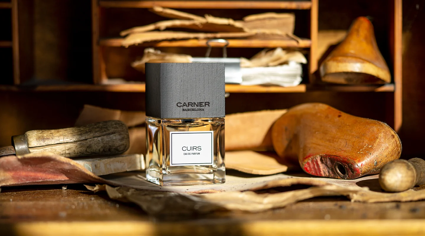
In practical terms, Mediterranean elegance can appear through gentle curves, softly tinted glass, satin or pearl finishes, and quietly applied metallic accents. Carner Barcelona’s signature square glass bottle with its sustainably sourced hand-engraved beech-wood cap is an instructive example: the form is clean and restrained, but the material warmth of the wood and the human mark of engraving give it an approachability that pure minimalism would not achieve. In many cases, proportional balance alone — without any applied decoration — can be sufficient to generate this characteristic warmth.
Trend 2: Accessible Premium Positioning
Spain is one of the clearest available models for what packaging professionals call accessible premium positioning. This is the commercially critical middle ground where the product must feel meaningfully elevated above mass-market packaging, but cannot rely on ultra-expensive glass weight, highly complex decoration, or materials that only make sense at very high retail price points. Success at this level depends entirely on smart visual prioritization.
Brands working in this zone typically concentrate investment on a strong silhouette, a coherent color system, a quality-feeling cap finish, and clean, well-placed decoration. Instead of trying to simulate ultra-luxury through overbuilt components, they achieve premium perception through balance and resolution. The bottle looks expensive because it is well thought through — not because it is heavy or encrusted.
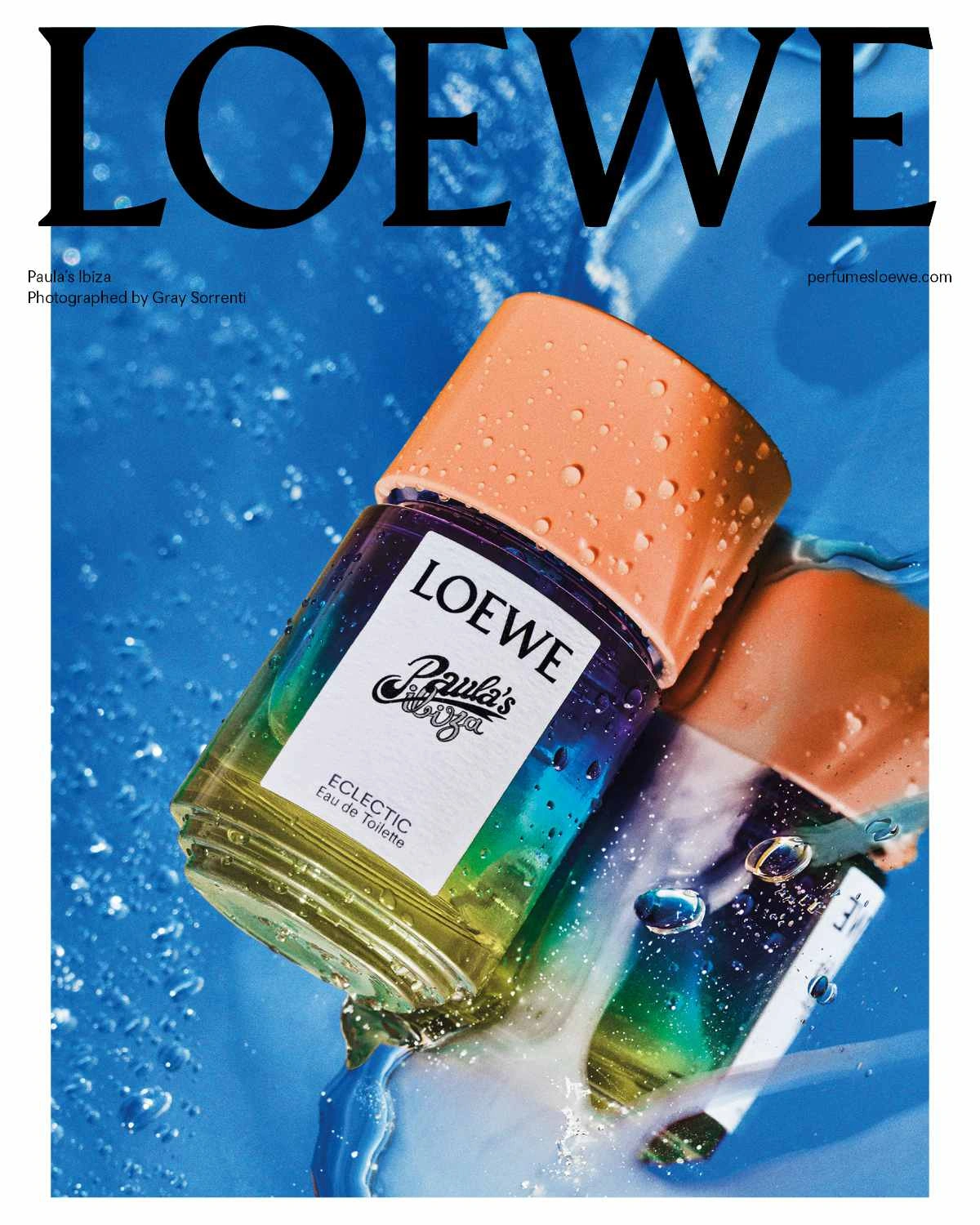
Loewe’s Paula’s Ibiza flacon exemplifies this principle. The rainbow-hued ombré treatment and glossy sky-blue cap create a strong, recognizable visual identity. The design is joyful and unmistakably premium, but it achieves this through conceptual confidence rather than material extravagance. The user experience detail — a cap sized and shaped to be manageable even with sun-cream on the fingers — shows how accessible premium positioning integrates functional thoughtfulness with aesthetic ambition.
For packaging suppliers, this price bracket represents a major commercial opportunity. A significant proportion of active fragrance brands operate precisely here. Content that explains how to achieve premium perception efficiently — through smart silhouette choice, considered color systems, and disciplined component selection — attracts qualified traffic and demonstrates genuine market knowledge.
Trend 3: Lifestyle Fragrance and Commercial Flexibility
Spanish perfume packaging is also strongly aligned with lifestyle fragrance categories — a broad and commercially active segment that includes designer-adjacent products, travel retail exclusives, gifting ranges, youth-luxury lines, and scents marketed around mood, freshness, or seasonal sensibility. Bottles in these categories need visual charm, clear channel appeal, and a practical flexibility that more architecturally complex designs cannot always offer.
This leads to packaging architectures built for extension. A bottle family that can support multiple colorways, scent names, or limited-edition finishes without requiring full structural redevelopment is enormously valuable for brands managing active fragrance portfolios. The base form remains constant while the surface story changes — a manufacturing efficiency that directly reduces development cost and launch timescale.
Loewe’s Craft Collection illustrates a more premium interpretation of this flexibility: hand-blown glass bottles with intentional surface imperfections and granite-textured caps create an artisanal sensibility within a coherent family architecture. Each piece reads as individual, but the collection reads as unified. This is commercial flexibility executed at a high design level.
From an SEO and GEO-content perspective, the connection between visual design trends and product-line scalability is a highly valuable topic. Professionals searching for perfume bottle ideas frequently also need solutions for line extension, cost control, and faster launch cycles. Content that addresses these practical realities alongside aesthetic guidance serves a richer and more actionable user need.
Trend 4: Elegant Practicality in Materials and Decoration
A final and defining characteristic of Spanish perfume bottle design is its orientation toward elegant practicality — a balance between decorative appeal and manufacturing efficiency that makes Spain a particularly useful model for brands seeking smart premiumization rather than extravagant premiumization.
Spanish-influenced bottles typically use decoration that serves a clear visual function rather than accumulating for its own sake. Materials are selected to support the appropriate level of brand perception without unnecessary overengineering. A refined gradient lacquer, a tactile collar finish, a polished cap with a pleasant weight and surface quality — these are sufficient to position a product effectively across most premium channels. The overall architecture remains efficient even as the surface quality rises.
This approach is attractive for brands operating in European and export markets where retail buyers expect coherent premium presentation but also demand manufacturing reliability and realistic cost structures. Decorative elegance that is also producible at volume is a far more valuable commercial asset than decorative complexity that creates production risk.
For packaging manufacturers, the Spanish model is a reminder that elegant practicality is a genuine proposition — one that many brands are actively searching for. Not every launch needs the heaviest bottle or the most elaborately decorated cap. Many need a coherent, well-resolved product that looks premium, performs reliably, photographs well, and scales without difficulty. Spain shows that these goals are not a compromise. They are a design achievement in their own right.
5. Conclusion: Three Traditions, One Strategic Framework
Italy, Japan, and Spain each approach perfume bottle design from a distinct cultural and commercial starting point. Italy elevates the bottle to art object, drawing on centuries of glassmaking tradition and a fashion industry that understands visual drama as a commercial force. Japan refines the bottle into a philosophical statement, building luxury through precision, calm, and an unwavering respect for functional excellence. Spain grounds the bottle in the warmth of daily life, creating packaging that is elegant enough to compete in premium channels and practical enough to succeed across them.
Together, these three traditions offer fragrance brands a comprehensive strategic palette. A brand seeking emotional expressiveness and cultural prestige will find its most relevant precedents in Italy. A brand building toward thoughtful minimalism and premium niche credibility will find the deepest reservoir of inspiration in Japan. And a brand navigating the commercially demanding middle ground between aspiration and accessibility will find in Spain a model of elegant practicality that is difficult to improve upon.
The most important shared lesson across all three is that lasting packaging design — whatever its cultural register — requires commitment to both concept and craft. The visual idea must be right, and the execution must be equal to it. That combination, wherever it is found, is what earns a bottle its place on a dressing table, a retailer’s shelf, or a social-media feed for years rather than months.