1. Form Is the First Language
Before a fragrance has a name on a billboard, before a single word of copy is written, before a customer reads the notes on the back of the box — they see the bottle. That first visual impression does an enormous amount of work. It communicates price point, brand personality, gender coding, scent character, and emotional register all at once. And in France, where the world’s most influential fragrance houses have spent decades refining exactly this visual language, the design of the bottle itself has become one of the most sophisticated tools in luxury branding.
The shape of a French perfume bottle is never accidental. Whether it’s the severe geometric clarity of Chanel No. 5, the continuous curve of a Hermès cylindrical flacon, or the sharp-edged fluting of a Céline Haute Parfumerie bottle, every design decision has been considered, debated, and arrived at deliberately. These are not just pretty containers. They’re visual arguments — precise propositions about what beauty looks like and what luxury feels like.
This article goes deep into the specific design styles that define French perfume bottle aesthetics today: the silhouette families, the surface treatments, the proportional logic, and the design codes that make certain bottles feel immediately timeless while others feel merely fashionable. If you’re a fragrance brand trying to build a visual identity that lasts, a packaging supplier trying to understand what your most discerning clients are actually asking for, or a designer navigating the gap between inspiration and execution, this is where to start.
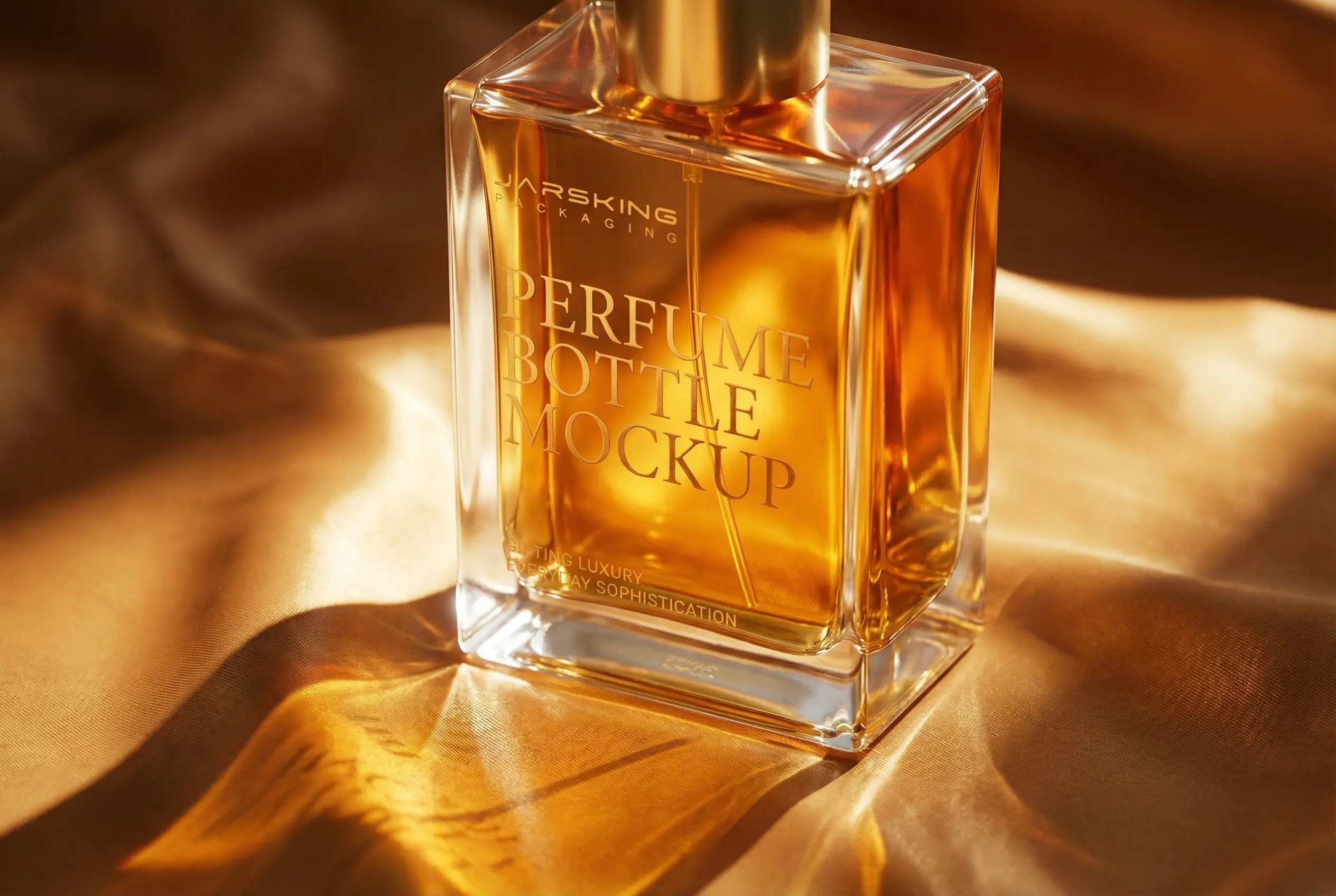
2. The Rectangular Bottle: Geometry as Authority
No shape has done more to define French fragrance aesthetics than the rectangle. Coco Chanel introduced the now-iconic rectangular flacon for Chanel No. 5 in 1921, specifically to break with the ornate, baroque crystal bottles that dominated the era. It was a radical act of restraint — a bottle that communicated confidence through geometry rather than decoration. The design was refined in 1924, with beveled corners that some design historians believe were inspired by the layout of Place Vendôme, Paris’s famous jewelry district. Since 1954, that bottle has been part of the permanent collection of MoMA in New York — the only perfume bottle to achieve that distinction.
The rectangle endures in French fragrance design because it communicates a specific set of values: structure, precision, authority, and modernity. It is not a shape that asks for your affection. It commands your respect. Angular and rectangular bottles are particularly well-suited to woody, spicy, and fresh fragrance profiles — scents that have directness and clarity — because the visual language of the shape reinforces what the nose experiences.
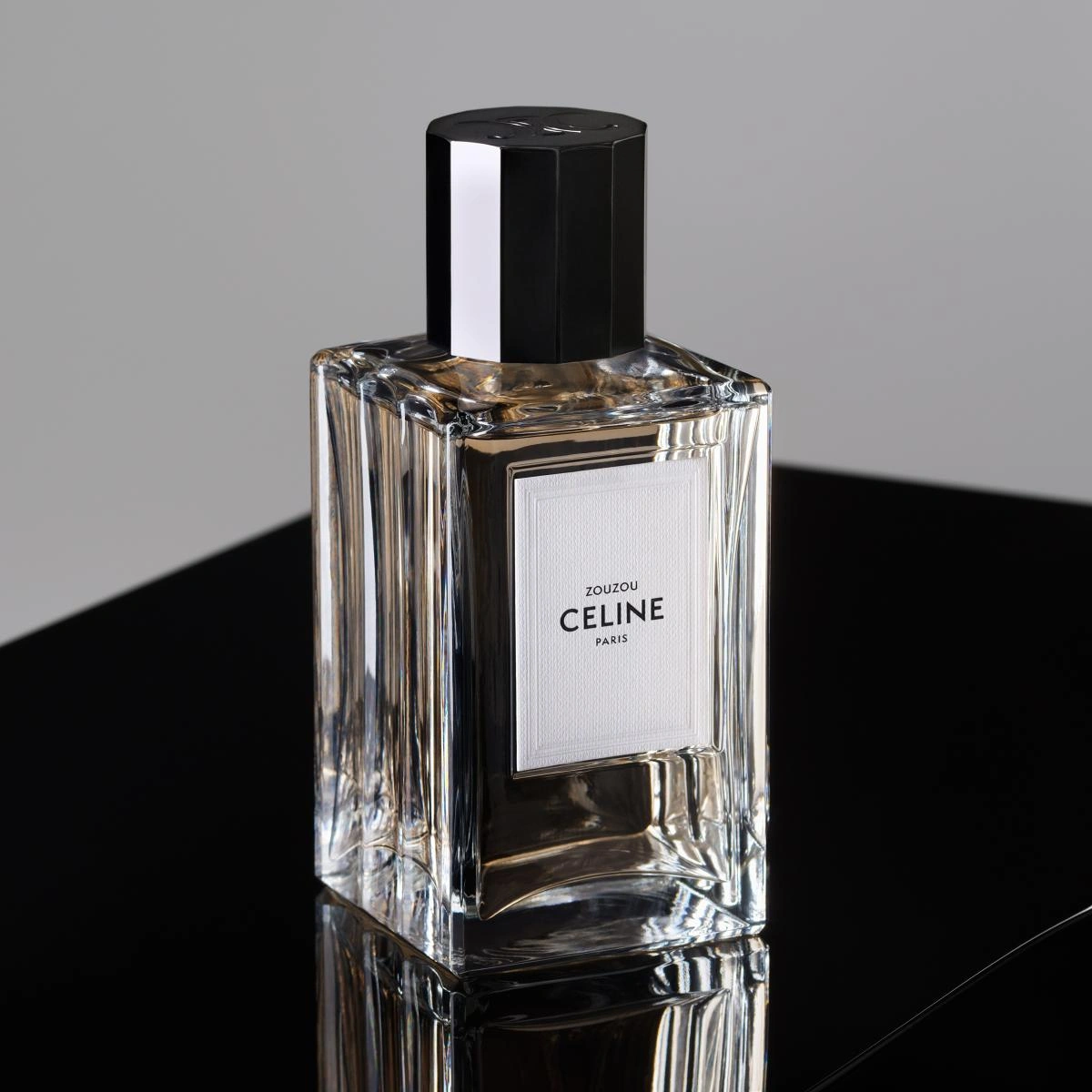
Céline’s Haute Parfumerie line, created by Hedi Slimane, is one of the most intellectually complete examples of the rectangular style in contemporary French perfume design. The bottle draws directly from French glassmaking tradition, with solid weight and sharp-edged fluting that give it architectural structure and presence. The transparent glass reveals amber-gold tones that shift with the light, while the faceted black lacquered cap adds a modern, graphic finish. The design references two distinct periods simultaneously — the classicism of 17th-century French interiors (specifically the woodwork panelling at the Hôtel Colbert de Torcy, Céline’s atelier at 16, rue Vivienne) and the clean lines of Art Deco geometry. It’s heritage and minimalism working together, neither apologizing for the other.
From a manufacturing standpoint, the rectangular bottle is one of the most technically demanding shapes to produce at luxury quality. Flat planes reveal mold seams, glass defects, and surface imperfections far more mercilessly than curved surfaces. Every corner needs to be crisp and consistent. Every plane needs to be optically flat and free of waviness. When a brand is relying on the purity of rectangular geometry to communicate premium quality — with no decorative flourishes to distract the eye — the glass itself must perform at a higher level than almost any other shape.
3. The Cylindrical Bottle: Continuity Without Edges
If the rectangle is the shape of authority, the cylinder is the shape of permanence. It has no beginning and no end, no hard corners or sharp transitions — just a continuous, uninterrupted form that moves the eye around it endlessly. That quality makes it one of the most naturally luxurious shapes in fragrance design, and it’s no coincidence that some of France’s most storied houses have made the cylinder their primary design language.
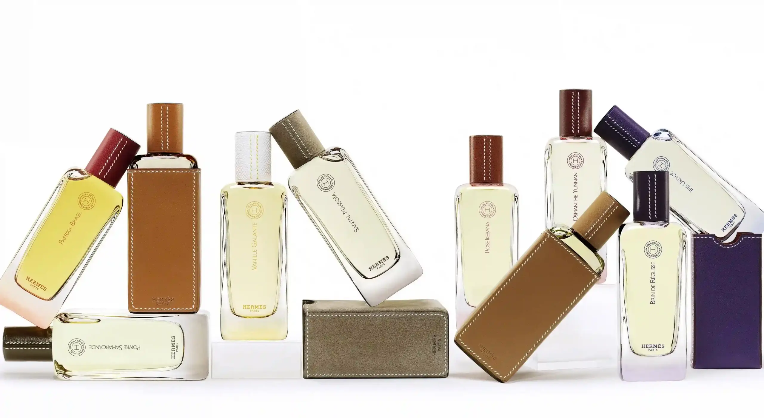
Hermès is perhaps the most compelling case study. The cylindrical flacon used across the Hermessence Collection is not simply a design choice — it’s an extension of the house’s fundamental identity as a maker of leather goods and equestrian equipment. The cylinder echoes the quiet curvature of saddle straps, the way leather coils and bends without breaking. When you hold a Hermessence bottle, the connection between the house’s physical heritage and its fragrance expression feels almost visceral. Perfumer Jean-Claude Ellena, who created many of the Hermessence fragrances, approaches each composition the way a poet approaches a haiku — restrained, purposeful, stripped to its essential gesture. The cylindrical bottle matches that philosophy precisely.
Frédéric Malle built his entire visual identity around the cylinder. His Bauhaus-influenced design ethos — functional, unfussy, rigorous — is perfectly expressed in a shape that has no excess to eliminate. The clear cylindrical flacon for Portrait of a Lady lets the deep ruby-red of the juice speak for itself. The stark typographic label in red and black adds editorial authority. Nothing competes. The bottle is, in a sense, a pure delivery system — and that restraint is itself the luxury statement.
Chanel’s Les Exclusifs collection extends the cylindrical language in a direction that’s slightly more contemplative. The Les Exclusifs de Chanel 1957 bottle — cylindrical, clear glass, free of decoration, with a black magnetic cap bearing the interlocking C logo — reflects Gabrielle Chanel’s foundational belief that the scent should speak louder than the bottle. The weighty glass and precise cylindrical form underscore formulation quality over surface ornamentation. It’s an argument that the fragrance inside is so good that the container only needs to get out of the way.
For designers working on cylindrical bottles, proportional calibration is everything. The relationship between bottle height and diameter, the weight of the base, the shoulder treatment at the top where the neck meets the body — these variables determine whether a cylinder reads as elegant or utilitarian, as luxurious or clinical. A cylinder that’s too tall and narrow can feel pharmaceutical. Too short and wide, it can feel squat and unimportant. The sweet spot is different for every brand positioning, which is why the best cylindrical flacons are always the result of significant proportional exploration during the design phase.
4. The Architectural Silhouette: Structure as Narrative
A growing number of French fragrance bottles today occupy a design space that’s harder to categorize by simple geometric shape — they’re better described as architectural. These are bottles that feel less like containers and more like small buildings, where every surface, edge, transition, and proportion has been designed with the deliberateness of a structure intended to last centuries.
Dior’s La Collection Privée Esprits de Parfums series exemplifies this approach. The redesigned bottles for this line are darker, sleeker, and more intentionally sculptural than their predecessors, with elongated forms and dark lacquered glass that creates a sense of depth and intensity. Francis Kurkdjian, Dior’s perfume creative director, describes the fragrances as “a synopsis” of each scent — distilled to their purest essence. The bottle design is the visual equivalent of that process: weighty, intentionally simple, without decoration that might dilute the message. The dark lacquered form becomes a vessel for the fragrance’s emotional intensity, a visual metaphor for concentration and precision.
What makes architectural silhouette design particularly powerful in the French context is the way it allows a bottle to reference its heritage without being nostalgic. The original Miss Dior bottle of 1947, designed when Christian Dior himself was still at the house, drew inspiration from ancient amphora vases — a reference to femininity and timeless beauty that echoed the silhouette of Dior’s “New Look” dresses. That foundational reference — classical form, modern discipline — continues to inform how Dior approaches bottle architecture today. The shapes evolve, but the design logic remains consistent.
Louis Vuitton’s Les Parfums line, with bottles designed by Marc Newson, represents architectural minimalism expressed at a high level of craft precision. The clean glass lines, engraved logos, and refillable mechanisms are all part of a design language built around the Maison’s core values of travel, craft, and permanence. The LVERS fragrance, developed in collaboration with Pharrell Williams, follows this same architectural logic — the signature cylindrical flacon with a prismatic golden juice — but extends it into a more contemporary emotional register. Architecture here is not just about form. It’s about communicating a set of values through physical design.
5. Surface Design: What Happens Between the Edges
The silhouette of a bottle is the loudest design statement. But the surface — how that glass behaves between its edges, what it does with light, how it feels under the fingers — is where French luxury packaging becomes genuinely irreplaceable.
French bottle design uses surface treatment as a secondary vocabulary, one that speaks underneath the primary message of shape. Faceting is one of the most distinctive tools: cutting the glass surface into precise flat planes that catch and refract light in controlled ways. French Art Deco perfumers were masters of this technique, and its influence is still visible in bottles like Céline’s Haute Parfumerie flacon, where the sharp-edged fluting of the glass body creates a play of light and shadow that changes as the bottle moves. Facets reward close attention — they’re the kind of detail that makes a bottle more interesting the longer you look at it.
Frosted and satin glass finishes occupy a different register. Where clear glass is transparent and revelatory, frosted glass is intimate and suggestive. It conceals the fragrance inside while creating a surface that catches ambient light softly, without the hard reflections of polished glass. Frosted finishes are particularly effective for feminine and floral fragrance positioning, where the visual softness of the bottle reinforces the olfactory character of the scent.
Lacquered surfaces — often used on the body of the bottle rather than just the cap — introduce color in a way that feels integrated rather than applied. Dark lacquered glass, as used in Dior’s Esprits de Parfums series, creates a sense of depth that printed glass can’t replicate. The color becomes part of the material, not a layer on top of it. Tom Ford’s Private Blend white lacquered bottles achieve a similar effect in reverse — the monolithic ivory surface reads as almost architectural, like a chess piece or a modernist sculpture.
Pleating is a surface approach that’s particularly interesting in current French design. Chloé’s Atelier des Fleurs flacon uses sculptural pleats across the glass body — a direct reference to couture fabric construction, where pleats create both texture and dimension. The pleats give the bottle a tactile quality that a flat surface can’t achieve, and they reference the house’s fashion heritage in a way that feels genuinely integrated rather than decorative. Slight irregularities in the ivory stone-carved cap surface reinforce the collection’s emphasis on nature’s imperfections as a form of beauty.
For manufacturers, surface design is where production consistency becomes most critical and most difficult. Faceting requires precise mold engineering and consistent glass fill to ensure that every face of every facet is optically true. Lacquered surfaces require meticulous application and curing to avoid runs, variation in finish depth, or adhesion failures. Frosted surfaces require controlled etching that achieves uniform texture across the entire bottle. Any inconsistency in these treatments is immediately visible in retail lighting and social-media photography — environments where surface perfection is non-negotiable.
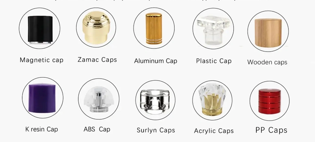
6. The Cap: Where Shape Becomes Signature
The cap is where French perfume bottle design is currently most inventive, most brand-specific, and most commercially significant. It’s the element that completes the silhouette, creates the first tactile interaction, and — in many contemporary designs — carries the most concentrated expression of brand identity.
Chanel’s interlocking C logo on the magnetic black cap of the Les Exclusifs bottles is a masterclass in how a cap can simultaneously close a bottle and open a brand conversation. The cap is proportionally generous — not oversized, but substantial enough to feel intentional. The magnetic closure creates a soft, definitive click that communicates precision engineering. And the logo placement is clear without being aggressive, commanding attention without shouting.
Céline’s Triomphe emblem, engraved on the cap of each Haute Parfumerie bottle, carries a remarkable amount of history in a very small space. The motif was chosen by Céline Vipiana in 1971 after she noticed her initial “C” mirrored in the chains encircling the Arc de Triomphe in Paris. That symbol — architectural, Parisian, personal, and geometrically elegant — has represented the house’s identity for over fifty years. Placing it on the bottle cap makes every opening of the fragrance a small moment of brand engagement.
Frank Gehry’s crumpled aluminum cap for Louis Vuitton’s Les Extraits collection shows what’s possible when a cap is treated as genuine sculpture rather than a functional component with decorative ambitions. Gehry took a sheet of aluminium and sculpted it into a twisting, blossoming flower — his first perfume bottle design, and one he described as a pursuit of “movement, visual movement with the added interest of ephemerality”. The cap references the architectural DNA of the Louis Vuitton Foundation in Paris, which Gehry also designed. It makes the entire bottle feel like a collectible art object, which is precisely the positioning Les Extraits requires.
Cap materials tell their own story. Zamak — a zinc-based alloy — remains the material of choice when a cap needs to carry fine detail, accept high-quality metal finishing, and communicate substantial weight. Resin allows for more complex geometric forms and a wider range of surface treatments, including lacquers, metallizations, and soft-touch finishes. Glass caps, where the cap material matches the bottle, create a visual unity that reads as exceptionally refined. Natural materials — wood, stone, horn, leather — appear in niche and artisanal contexts, adding sensory warmth and differentiation that no synthetic material fully replicates.
The fit and closure behavior of the cap is a production variable that deserves more attention in design discussions. A cap that closes with a firm, satisfying precision communicates quality in a way that no decoration can replicate. French brands treat cap-to-neck fit as a first-order performance requirement, not a manufacturing detail. For suppliers, the ability to guarantee consistent fit across large production runs — with tolerances tight enough to ensure that every cap closes with the same feel — is a genuine competitive differentiator.
7. Proportion and Scale: The Variables That Everything Else Depends On
You can have the most beautiful rectangular silhouette, the most refined glass surface, and the most exquisitely finished cap — and the bottle can still feel wrong if the proportions are off. Proportion is the least visible and most powerful design variable in fragrance packaging, and French houses have developed an almost instinctive understanding of how to calibrate it.
The relationship between bottle height and width is the most obvious proportional decision, but it’s far from the only one. The height of the shoulder — the transitional zone between the bottle body and the neck — determines whether the bottle reads as elegant or stubby, architectural or organic. A high, abrupt shoulder creates geometric tension and visual clarity. A low, gradual shoulder creates fluidity and softness. Neither is inherently better; they’re appropriate for different brand personalities and fragrance characters.
Base thickness is a proportional decision with both aesthetic and practical dimensions. A thick, generous base gives a bottle presence and stability — it anchors the form visually and makes it feel substantial in the hand. But a base that’s too heavy relative to the bottle body can make the design feel bottom-heavy and awkward. The best French bottles achieve a base weight that contributes to the luxury impression without distorting the overall proportional balance.
Neck length and diameter are proportional variables that often separate professional design from amateur execution. A neck that’s too long creates a precarious, fragile feeling. Too short, and the bottle loses elegance. The diameter of the neck in relation to the body is equally important — a neck that’s proportionally too wide looks squat, while one that’s too narrow can look delicate in a way that suggests fragility rather than refinement. These are the kinds of proportional decisions that experienced designers make intuitively, but that require significant iterative prototyping to get exactly right.
For brands working with contract manufacturers or packaging suppliers on custom bottle development, proportional exploration is one of the most valuable things that can happen in early-stage design collaboration. 3D visualization has improved enormously in recent years, and good suppliers can show clients how a bottle will read under different lighting conditions, at different scales, in different orientations — before a single mold is cut. That capability is worth investing in.
8. Vintage Revival and Heritage Shapes: When the Past Is the Point
Not every contemporary French perfume bottle is pursuing forward-looking minimalism. A significant and commercially robust design current runs in the opposite direction — toward vintage-inspired flacons that draw deliberately from the aesthetic vocabulary of past eras, particularly the Belle Époque, Art Nouveau, and Art Deco periods.
This vintage revival is not nostalgia for its own sake. The most sophisticated examples use historical design references as emotional anchors while incorporating contemporary materials, closures, and manufacturing standards. Old shapes like flacons with round shoulders pair with clean modern typography or plain label design. Atomizer sprayers with neck strings — a detail with roots in early 20th-century Parisian perfume culture — reappear in contemporary niche collections, but now with black chrome or gentle gold hardware instead of vintage brass.
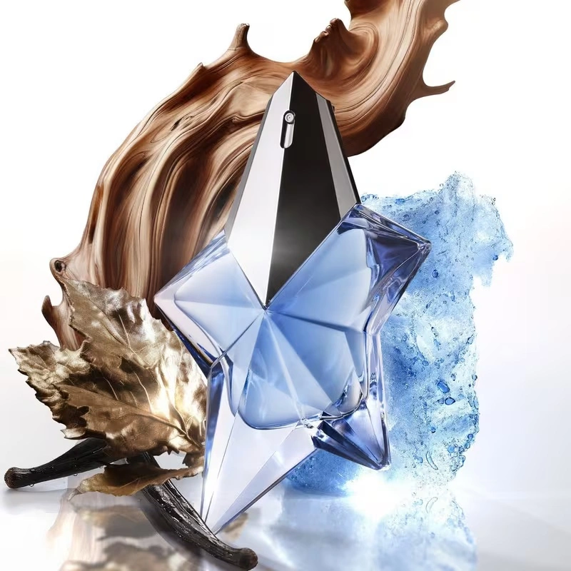
Art Deco references are particularly potent in current French bottle design. The geometric rigor, the controlled use of metallic accents, the interplay of clear and colored glass — these are design codes with enormous emotional resonance for consumers who associate them with Paris, glamour, and the golden age of French luxury. Thierry Mugler’s Angel, launched in 1992 with its star-shaped bottle that French glassmakers initially refused to attempt, became one of the most commercially successful fragrance bottles in history precisely because it combined an impossible, surreal geometric form with a powerful emotional narrative. The shape didn’t just contain the fragrance — it became its most memorable expression.
For brands exploring vintage revival aesthetics, the design challenge is calibrating how far back to reach and how clearly to mark the contemporary interpretation. A bottle that reads as a direct historical pastiche can feel like a costume rather than a design. The most successful vintage-inspired French bottles use historical forms as a starting point and then exercise enough design restraint and material precision to make the result feel both familiar and new.
9. Color, Glass Tone, and the Language of Transparency
One dimension of French bottle design that doesn’t always get the attention it deserves is color — specifically, how the color of the glass itself (rather than applied decoration) contributes to the design story.
Transparent flint glass is the dominant choice in contemporary French luxury packaging because it serves two functions simultaneously: it demonstrates the purity and quality of the glass itself, and it allows the color of the fragrance juice to become part of the visual design. A deep amber juice in a clear cylindrical bottle (as in Louis Vuitton’s LVERS) becomes a warm, luminous presence that changes character throughout the day as light conditions shift. A pale golden liquid in a clear rectangular bottle reads very differently from a deep red juice in the same shape. The fragrance’s visual identity and its olfactory character become aligned through this transparency.
Amber glass offers a warmer, more enveloping aesthetic and connects visually to the apothecary tradition — bottles that reference the laboratory and the dispensary rather than the fashion house. This association gives amber glass a particular effectiveness for niche and artisanal brands positioning around natural ingredients and craft formulation.
Colored glass — deep navy, forest green, black glass, soft pink — is being used more selectively in current French design, often in limited editions or collection extensions where a dramatic visual statement is appropriate. Black glass, as used in Dior’s Esprits de Parfums series, creates an almost monolithic presence — luxurious and austere simultaneously, a material that absorbs light rather than reflecting it. The visual weight of black glass can make a relatively simple bottle form read as highly architectural.
10. What Great Bottle Design Requires From Manufacturers
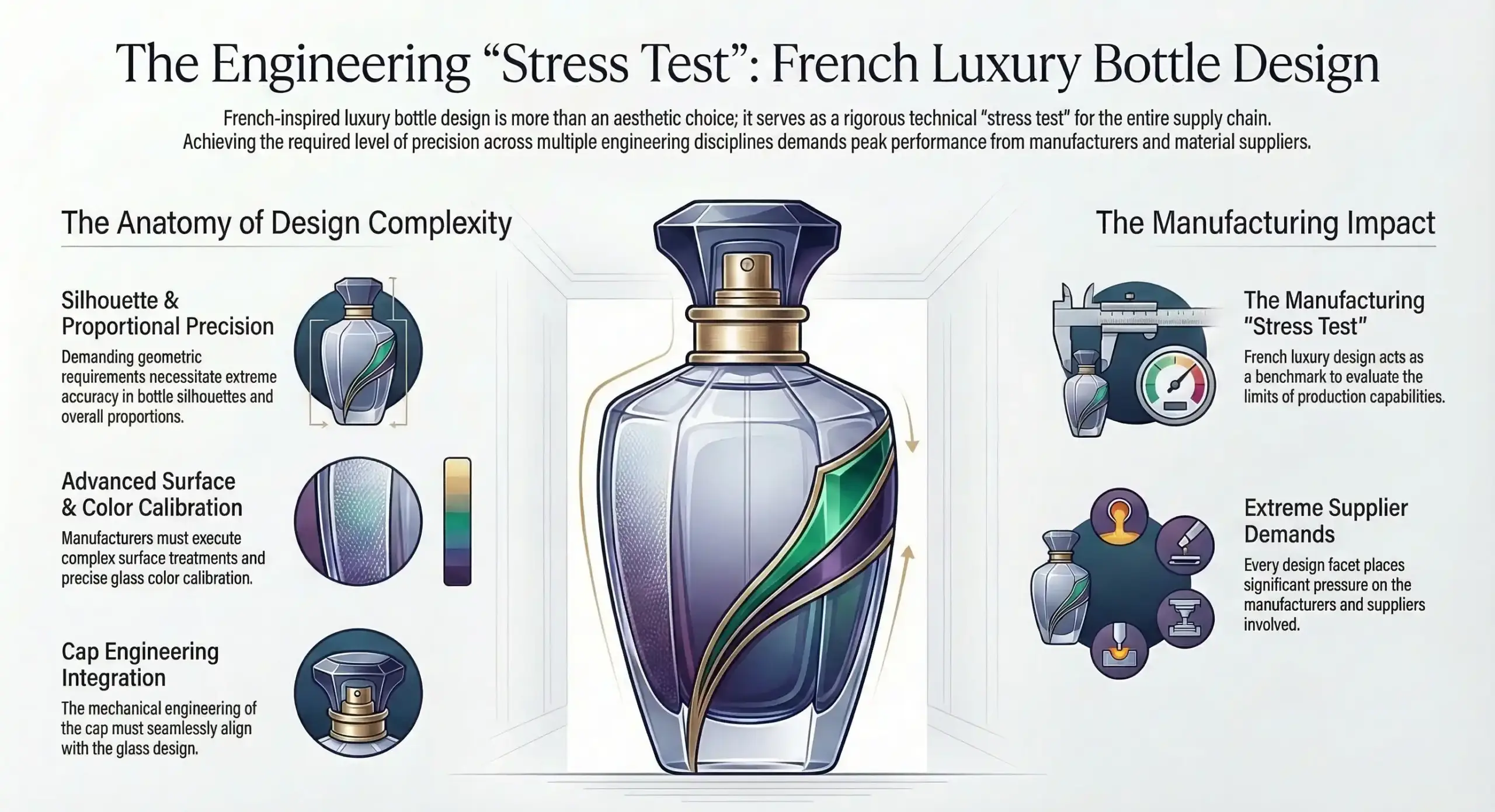
Everything described in this blog — the silhouette families, the surface treatments, the proportional precision, the cap engineering, the glass color calibration — places significant demands on the manufacturers and suppliers who bring these designs to life. French-inspired luxury bottle design is, in many ways, a stress test for manufacturing capability.
The cleaner and more architectural the design, the less room there is for production variation. A flat plane on a rectangular bottle will show any waviness in the glass. A cylindrical surface will reveal any inconsistency in wall thickness. A faceted surface will expose any imprecision in the mold. A lacquered finish will make any surface defect visible under retail lighting. Minimalist luxury design is not easier to produce than heavily decorated packaging — it’s significantly harder, because execution quality is the entire design.
The most competitive manufacturers in this market are those who understand design intent deeply enough to anticipate problems before they reach production. That requires design collaboration capability, not just manufacturing execution. It means being able to discuss proportional options, surface treatment tradeoffs, glass quality implications, and cap engineering with brand designers at the concept stage — and to translate the outcome of those conversations into repeatable, scalable production outcomes.
Brands pursuing French-inspired bottle design should treat their packaging partner as a design collaborator rather than a production vendor. The decisions made in early-stage development — about glass quality, mold geometry, surface treatment approach, cap material and fit tolerance — determine everything that follows. Getting those decisions right at the beginning is faster, cheaper, and ultimately more commercially successful than correcting them in production.
11. The Bottle as Brand Equity
There’s a reason that Chanel No. 5’s bottle has been in continuous production for over a hundred years with minimal changes. There’s a reason that Hermès’s cylindrical flacon is immediately recognizable without a label. There’s a reason that consumers actively seek out and display fragrance bottles long after the juice inside is gone.
Great bottle design creates brand equity that compounds over time. A silhouette that becomes associated with a specific house — through consistent use, quality execution, and genuine design intelligence — becomes worth more than any advertising campaign. It becomes a mark of recognition that travels across markets, cultures, and consumer generations without requiring translation.
France has produced more bottles that achieve this status than any other country, and the reason is not accident or heritage alone. It’s a consistent commitment to the design principles explored throughout this article: geometric discipline, proportional precision, surface refinement, cap craftsmanship, and the understanding that every physical detail of a bottle is a communication — about quality, about values, about who the brand is and who it’s for.
For fragrance brands building for the long term, the lesson is clear: invest in bottle design as seriously as you invest in fragrance formulation. The scent will do its work invisibly, through skin chemistry and memory. The bottle will do its work visibly, every time it sits on a shelf, catches light on a dressing table, or appears in a photograph. Make sure it’s saying exactly what you mean.