Perfume packaging does much more than protect glass; it frames the entire experience of the fragrance before the first spray. The moment someone sees a perfume box, they begin to infer price, quality, personality, and even who the scent is “for,” using quick visual cues like color, typography, and structure. On crowded shelves or in small online thumbnails, these cues act as shortcuts that help overwhelmed shoppers decide which perfumes deserve a closer look, which get ignored, and which feel compelling enough to buy.
Introduction: The silent power of the perfume box
Perfume boxes quietly do far more than cover a bottle; they frame how a fragrance will be judged before it is ever sprayed. Faced with a wall of sealed boxes, shoppers instinctively scan for quick visual and tactile cues—color, typography, structure, and materials—to decide which ones deserve their limited attention. In those first seconds, the box becomes the crucial handshake between brand and buyer, hinting at price level, quality, personality, and even the kind of wearer the scent seems designed for.
In this setting, packaging operates as a powerful decision shortcut rather than simple protection. Overwhelmed consumers use surface signals to form instant expectations about whether a fragrance will be light or intense, playful or sophisticated, mainstream or niche. For online shoppers who cannot smell or touch anything, the photographed box often becomes the primary basis for choice, so treating box design as a mere aesthetic extra is a costly mistake—it directly influences perceived value, click-throughs, and ultimately whether a perfume ever gets the chance to be experienced.
First impressions and consumer psychology
People make up their minds about a perfume box in a fraction of a second, long before they think they are “deciding.” Psychologists call this “thin-slicing”: using small slices of information—like color, finish, or typography—to build a fast story about what the product is like and who it is for. From one glance, a box can feel expensive or cheap, playful or serious, romantic or minimalist, and those impressions strongly affect which perfumes get picked up, sampled, or clicked on.
To move quickly, shoppers lean on mental shortcuts, or heuristics. One common shortcut is the price–quality heuristic: carefully crafted, heavy, or intricately finished packaging is assumed to contain a higher-quality fragrance than a flimsy, flat-printed carton. Familiar brand cues—logos, signature colors, and a consistent visual language—also reduce perceived risk, because people feel safer choosing what they recognize over something completely new.
Emotion quietly ties all this together. Visual and tactile choices on the box can prime specific moods—comfort from soft textures and muted tones, excitement from bold colors and sharp contrasts, sensuality from dark palettes and metallic accents. These emotional cues often shape expectations of the scent even before it is smelled, nudging buyers toward or away from a purchase based on how the packaging makes them feel in that first brief moment.
Visual hierarchy and attention on the shelf
On a busy shelf, getting noticed is the first battle. A perfume box has only a brief On a crowded display, a perfume box has only a heartbeat to win attention, so what the eye notices first can decide everything. Visual hierarchy—the deliberate way elements are sized, placed, and contrasted—helps guide that first glance so shoppers instantly see what matters most instead of feeling lost in decoration.
Key information like the brand name, fragrance name, and any variant descriptors (“eau de parfum,” “intense,” “noir”) needs to be arranged so the eye naturally lands on them in order. Designers use tools such as larger type for the brand or fragrance name, strong contrast between text and background, and clear positioning near the visual center to keep these details legible even from a few steps away. Techniques like pairing light text on a dark field, combining matte backgrounds with glossy or metallic accents, or isolating the name within a simple frame help pull focus toward the most important words. When that hierarchy is weak, a box may look pretty but confusing, and if a shopper cannot quickly tell what the product is, they are far less likely to reach for it.
The real turning point is the shift from merely being seen to actually being picked up. Packages that balance strong visual impact with clarity—clean, readable text, a single clear focal point, and perhaps a distinctive silhouette or graphic motif—invite the hand as well as the eye. In a few seconds, that combination of order and character can separate a box that fades into the background from one that sparks curiosity and earns a closer look.
Color psychology in perfume boxes
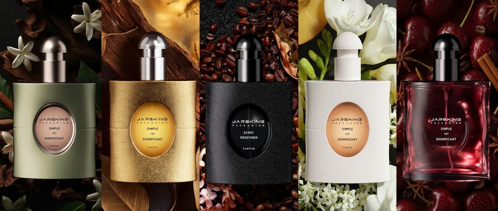
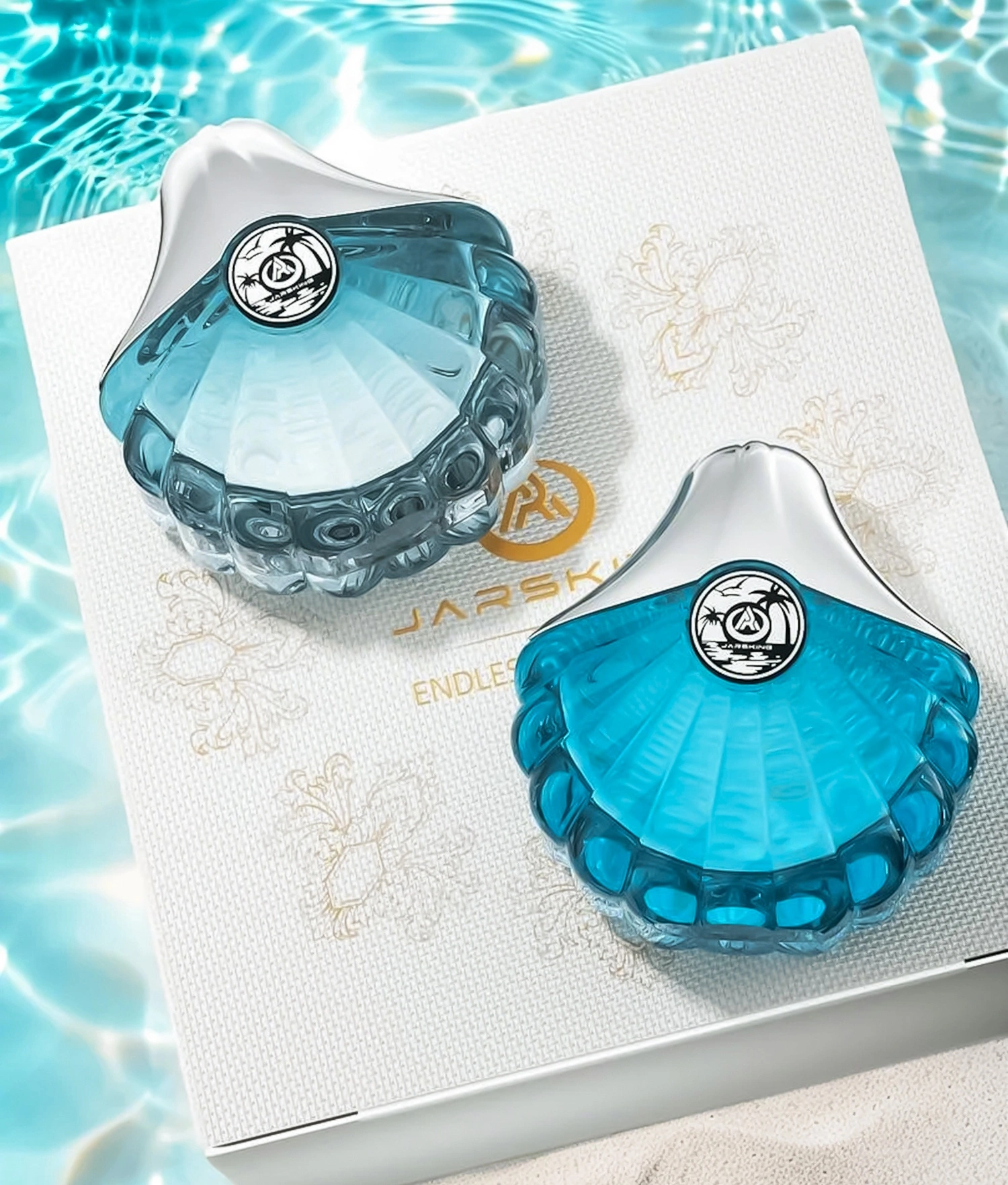
Color is one of the quickest ways a perfume box can signal what a fragrance “feels” like before anyone reads a word. In perfumery, certain palettes have become visual shorthand for specific moods, occasions, and fragrance families, so shoppers decode them almost instantly, often without realizing it. Soft pastels such as blush pink, pale lilac, and muted peach tend to suggest romantic, floral, or light daytime scents and are often aimed at a younger or more traditionally feminine audience, while deep blacks, navies, burgundies, and jewel tones are widely used for evening, intense, or luxury perfumes, hinting at richness and depth.
Neutrals like white, beige, grey, and taupe are closely associated with minimalism, cleanliness, and contemporary niche brands, implying subtlety, purity, or conceptual sophistication rather than overt glamour. By contrast, bright, saturated colors—turquoise, neon pink, vivid citrus yellows—communicate energy, fun, and trendiness, speaking to younger or fashion-forward consumers who want something bold and eye-catching. These quick emotional signals help shoppers match a box to an occasion or to their own style before they ever encounter a tester.
Color meanings are also tied to gender codes and cultural context. Traditionally, pinks and floral motifs have been coded as feminine, while darker blues, greys, and metallics have signalled masculinity, but the rise of unisex and gender-neutral fragrances is reshaping these conventions with restrained palettes, monochrome designs, and unexpected color pairings that deliberately blur gender lines. Cultural symbolism further complicates the picture: white may represent purity in one culture and mourning in another, while red can signal romance in one market and prosperity or good fortune in another, so successful brands balance broad psychological effects of color with local meanings when designing perfume boxes for different regions.
Typography, imagery, and style cues
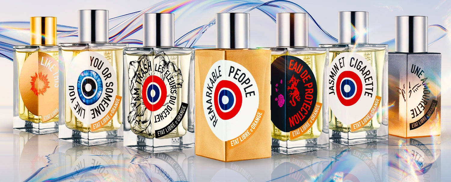
Typography on a perfume box works like a recognizable voice that sets expectations before the bottle is even seen. Serif typefaces tend to suggest tradition, heritage, and formality, which is why they often appear on classic or legacy house fragrances that want to feel timeless and refined. Clean, geometric sans-serif fonts communicate modernity, minimalism, and a more gender-neutral tone, making them a natural fit for contemporary, niche, and unisex offerings. Script fonts usually signal romance, sensuality, or old-world luxury, but if they are overly decorative or too small, they can quickly damage legibility and frustrate shoppers trying to read the name at a glance.
Imagery and iconography strengthen these typographic messages. Floral illustrations immediately hint at a bouquet-like or romantic scent, while more realistic botanical drawings can evoke natural ingredients, eco-conscious values, or a focus on raw materials. Cityscapes, maps, and travel-inspired motifs promise journeys, sophistication, or cosmopolitan lifestyles, suggesting that the wearer is worldly or adventurous. Abstract patterns and geometric shapes often point to conceptual, artistic, or experimental fragrances, appealing to buyers who see scent as a form of self-expression rather than just decoration.
For packaging to feel convincing, typography, imagery, and overall style must align with the brand’s positioning and the fragrance story. A house built on avant-garde minimalism would undercut its identity by suddenly using ornate, cluttered graphics and sugary scripts, just as a brand known for opulent heritage might confuse loyal customers with stark, clinical packaging that feels more like pharmacy skincare. When these style cues are consistent—type, visuals, color, and structure all telling the same story—shoppers can immediately understand what is being offered, decide whether it matches their tastes, and feel more confident picking up or purchasing the perfume.
Structure, materials, and the tactile experience
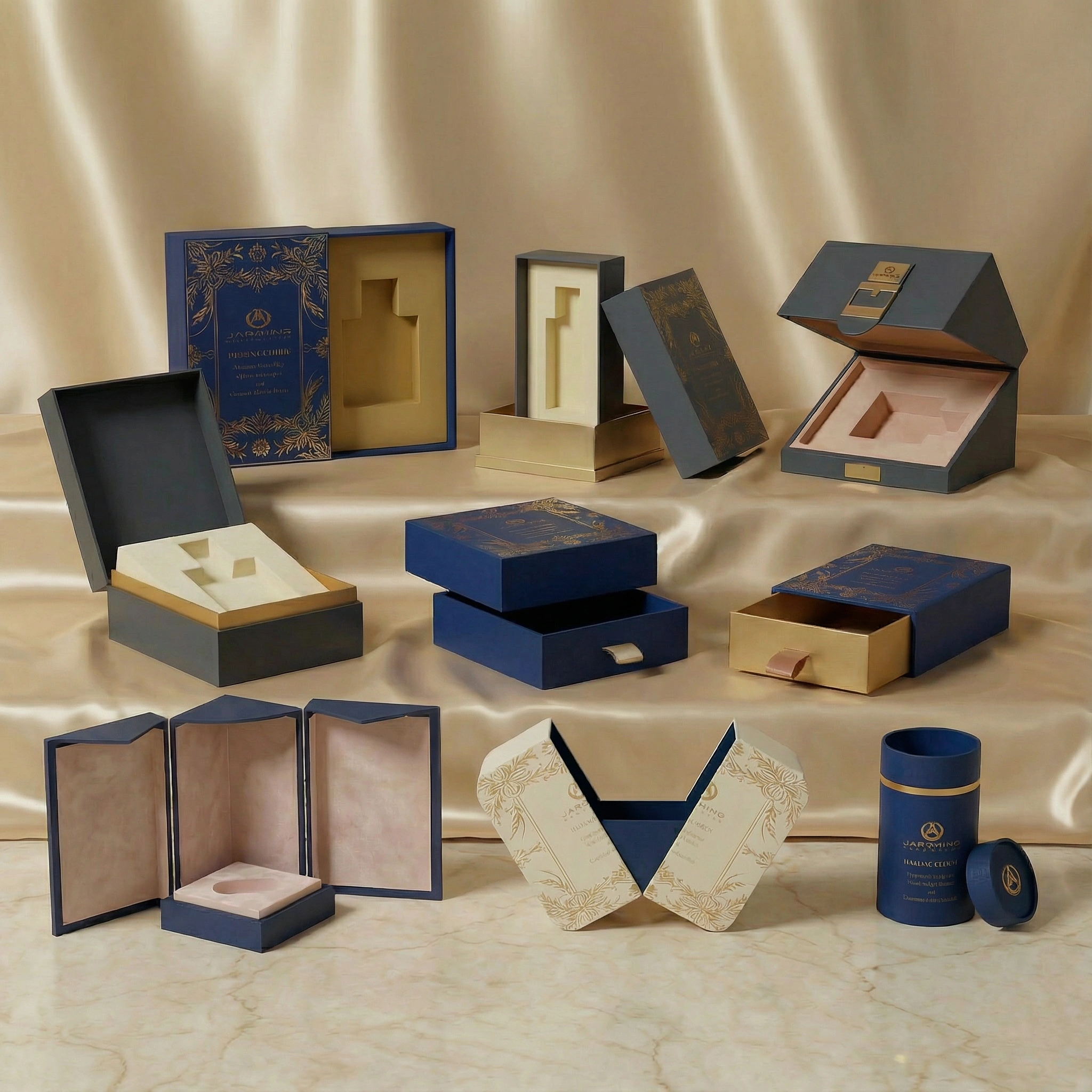
Beyond the visuals, the way a perfume box is built strongly shapes how expensive or special it feels. Lightweight folding cartons made from thin board can still look attractive, but they usually signal an everyday or mass-market product, while rigid boxes with thicker walls, sharp edges, and precise construction immediately suggest a more premium, gift-worthy fragrance in the buyer’s mind.
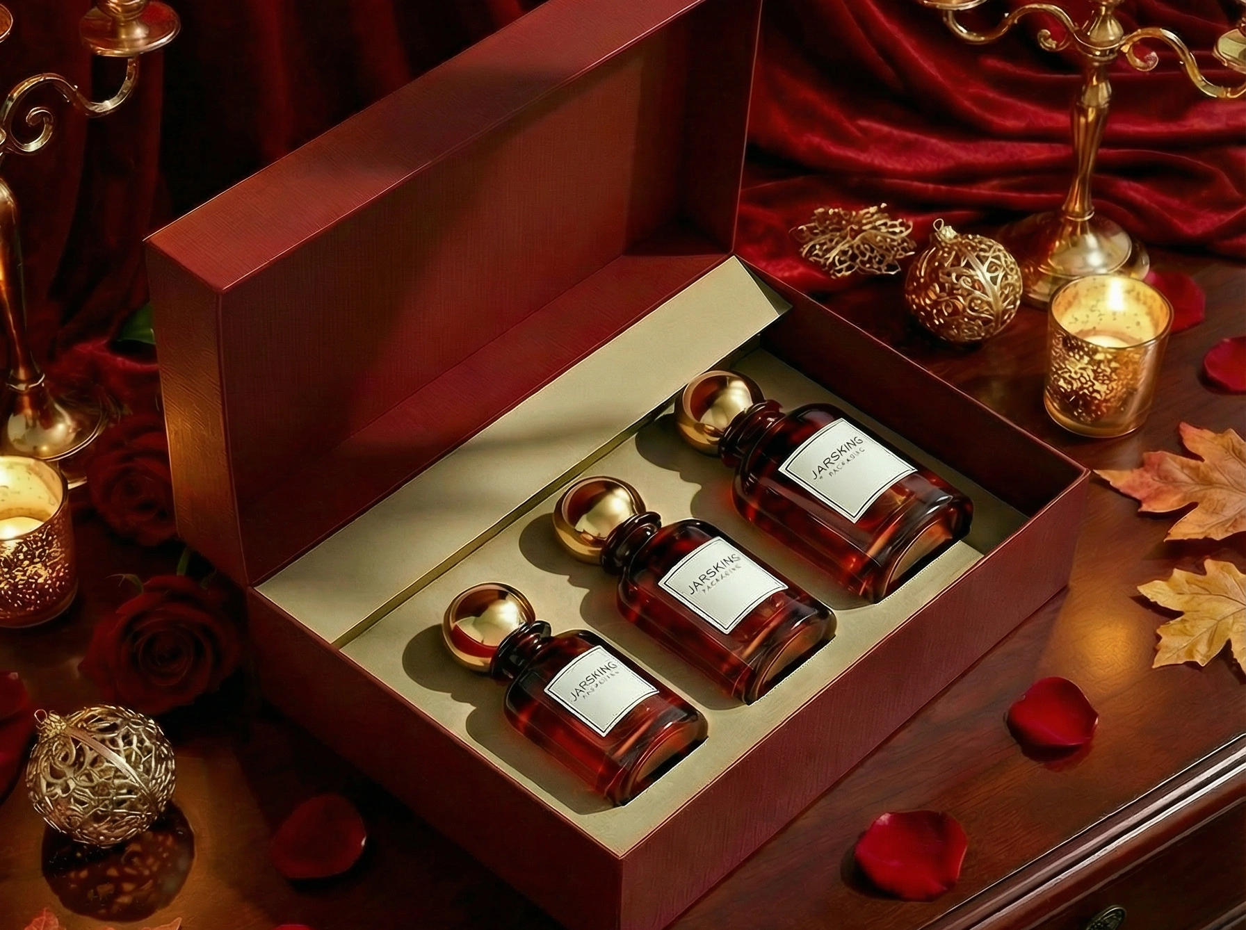
Structural details can turn opening the box into a small ritual. Slipcases, two-piece lift-off lids, drawer-style boxes, and magnetic closures all add stages to the unboxing process, building anticipation before the bottle appears. Surface finishes such as velvet-touch coatings, embossing and debossing, or foil stamping add rich tactile and visual layers, so the box already feels luxurious in the hand even before it reveals the scent.
What happens inside the box matters just as much. Custom inserts that cradle the bottle securely, printed interiors, and subtle surprises like hidden messages, patterns, or contrasting colors all signal care and craftsmanship. When users sense that this level of attention has gone into the packaging, they naturally assume similar care went into the fragrance itself—an effect that is especially powerful for gifts, where the recipient’s very first impression often comes from the outer packaging long before they experience the scent.
Branding and storytelling on the box
A perfume box has to condense an entire brand universe into a small, instantly readable surface, like a book cover for the story the fragrance wants to tell. That story can be explicit—spelled out through the fragrance name, a line name, taglines, and short descriptions—or it can be mostly implicit, conveyed through recurring colors, symbols, and aesthetic choices that feel recognizably “on brand” at a glance.
Thematic storytelling is a common way to make this universe feel rich and cohesive. One brand might create a travel-inspired line where each fragrance is tied to a different city or landscape, using maps, skylines, or architectural details on the boxes to suggest place and atmosphere. Another might build a collection around emotions or archetypes—joy, nostalgia, rebellion—using specific colors, textures, and imagery to express those inner states, while others draw on mythology, nature, or historical periods to invite customers into a curated, almost cinematic world.
Narrative collections take the idea further by turning each perfume into a “chapter” within a larger visual system. When multiple boxes share the same layout, typography, and structural design but vary in color, illustration, or pattern, they line up on a shelf like volumes in a series, reinforcing brand identity every time they are seen together. Numbered editions, seasonal releases, or boxes that create a continuous image when placed side by side can be especially effective at triggering collecting behavior, encouraging customers who enjoy one scent to return and “complete” the story.
Gender, identity, and cultural positioning
Perfume is deeply linked to identity, so its packaging often mirrors prevailing ideas about gender and culture. Traditionally, many brands have leaned on familiar gender codes: soft colors, curved forms, floral motifs, and delicate scripts for women’s fragrances, contrasted with dark palettes, bold typography, and angular shapes for men’s lines. These cues make it easy for shoppers to categorize products at a glance, but they can also feel narrow or dated as attitudes toward gender expression evolve.
The growth of unisex and gender-fluid fragrances has pushed packaging toward more inclusive visual languages. Boxes for these scents often use neutral or monochrome palettes, minimalist typography, and restrained graphics, intentionally avoiding clichés that scream “for him” or “for her.” This shift appeals to consumers who prefer to choose scents based on personality, mood, and taste rather than traditional gender labels, and it helps brands position themselves as modern and open-minded.
Cultural positioning adds another important layer. Brands inspired by specific regions or traditions frequently incorporate local patterns, scripts, symbols, or landscape references into their boxes to signal authenticity, belonging, or respectful homage. Done thoughtfully, this kind of culturally rooted packaging can resonate strongly with local audiences and attract global consumers seeking something distinctive and meaningful, but it demands care to avoid superficial borrowing or stereotypes that could feel exploitative rather than celebratory.
Source:https://www.perfume.com/blog/best-etat-libre-dorange-perfumes/?srsltid=AfmBOoqUZIky-9c8tVR3S-Ah3–Q47IWBy_LJru1-cEl4FfJeYBhJKm1
The gift factor: boxes as proxies for the fragrance
Perfume is one of the most traditional gifts, and in many cases the giver cannot—or does not want to—test the fragrance thoroughly beforehand. Instead, they lean heavily on how the box looks to judge whether the present will feel special, tasteful, and appropriate for the recipient and the occasion. In that sense, the packaging has to reassure the buyer that even if the exact scent is a surprise, the gift itself appears thoughtful and refined.
This is why ready-to-gift packaging has become such a major design focus. Boxes that incorporate decorative touches like ribbons, metallic accents, embossed patterns, or textured papers can feel complete without any extra wrapping, making gifting easier while still looking luxurious. Coordinated gift sets with matching items such as lotions, shower gels, or miniatures often use structured boxes with custom inserts and layered openings, turning the unboxing into a small piece of theatre that people may remember as vividly as the fragrance itself.
Designers are also thinking beyond the initial unwrapping, especially for higher-end perfumes. A box that is sturdy, visually striking, and reusable—as a keepsake, storage container, or decorative object—keeps the brand present in the home long after the bottle is first opened. Each time the box is seen or handled, it quietly refreshes the emotional memory of receiving or wearing the scent, extending both the life of the gift and the strength of the brand relationship.
Online shopping and thumbnail-first impressions
The rapid shift to online fragrance shopping has transformed how people encounter perfume boxes. On a physical shelf, packaging competes for attention in three dimensions, but on a product page it appears as a small image surrounded by many other small images, so designers must now think about how a box performs at thumbnail size as much as in the hand.
In digital environments, clear shapes and highly legible text become even more critical. Intricate details or subtle shimmer that look beautiful under store lighting often vanish in standard product photography, and delicate color contrasts can muddy on mobile screens, so photogenic packaging—strong silhouettes, distinctive color blocking, and high-contrast graphics—tends to translate far better into e-commerce imagery. Many brands also show boxes from multiple angles or add lifestyle photos to communicate texture, finish, and scale that a flat front shot cannot fully convey.
Social media has added another layer by turning packaging into shareable content. Unboxing videos, “shelfie” posts, and carefully styled product shots all reward designs that look striking on camera and offer a bit of drama. Features like unusual opening mechanisms, printed interiors, layered reveals, or hidden details give influencers and customers more to show and talk about, effectively turning the perfume box into ongoing, organic marketing long after launch day.

Price tiers and category positioning
Perfume boxes communicate price tier almost instantly. Budget and mass-market fragrances often rely on simpler folding cartons, modest board weight, and limited finishing techniques. That does not mean they cannot be attractive; clever graphics and smart color choices can make even modest packaging appealing. However, most consumers intuitively distinguish between such boxes and the heavy, multi-part, lavishly finished packaging associated with high-end or niche fragrances.
Masstige (mass prestige) brands occupy an in-between territory. They usually cannot afford full luxury packaging on every product, but they selectively employ premium cues such as foil, embossing, or rigid components on hero products, limited editions, or gift sets. The goal is to stretch perceived value without overspending on materials. Strategic restraint is important: too much embellishment for the actual price and scent quality can create unrealistic expectations and, ultimately, disappointment.
Over-packaging poses its own risks. A box that appears extremely luxurious but houses a mediocre or simple fragrance can feel deceptive. Customers may feel that too much of the price is paying for the packaging rather than the juice. Aligning the level of packaging opulence with the actual product experience is essential for building trust and long-term brand loyalty.
Sustainability and ethical perceptions
Growing concern about the environment means perfume boxes are judged not only on beauty but also on responsibility. Lavish, oversized cartons with multiple plastic components can still look impressive on a shelf, yet they increasingly signal wastefulness to shoppers who wonder why so much material is needed for a single bottle. When that question arises, over-packaging quickly shifts from perceived luxury to a liability that can damage brand image.
In response, many brands are testing more sustainable solutions such as recycled and recyclable boards, mono-material structures that are easier to process, and designs that sharply reduce or eliminate plastic. Minimalist aesthetics naturally support lower material use and simpler construction, but they must still feel special enough to compete in a category built on indulgence and pleasure, so designers often lean on rich textures, carefully chosen typography, and restrained metallic accents to create a refined impact without unnecessary bulk.
Communication plays a key supporting role. Subtle on-pack notes about recycled content, responsible sourcing, or reduced packaging footprint can help align the box with consumers’ values, but these claims need to feel authentic to be trusted. If a box looks obviously over-engineered, a tiny eco-label may seem hollow, so the real challenge is to weave ethical choices into the design in a way that preserves the emotional and aspirational qualities that make perfume so appealing in the first place.
Practical guidelines for brands and designers
Effective perfume box design starts with strategic clarity, not decoration. Before sketching, brands and designers need firm answers to a few core questions: Who is the primary audience? What emotion should the fragrance evoke—comfort, seduction, joy, mystery, calm, confidence—and for which occasions and price level is it intended? The box should then be built as a physical expression of those decisions, so that a quick glance already “feels” like the right scent for the right person.
From there, several practical principles can guide the work:
•Ensure legibility and strong hierarchy so brand and product names are clear at a glance, both up close and from a distance.
•Use color intentionally, matching the palette to the target audience, fragrance character, and cultural context instead of following trends blindly.
•Align typography and imagery with the overall brand identity and story, so the box feels like part of a coherent universe rather than a one-off experiment.
•Choose structures and materials that balance perceived value, cost, and sustainability, signaling the right tier without unnecessary waste.
•Design for both physical and digital contexts, making sure the box works on shelves, in hands, and in small online thumbnails or social posts.
Finally, testing is indispensable. Watching people handle prototypes—what they notice first, how they open the box, what they assume about the scent—often reveals issues and opportunities no screen mockup can show. Small tweaks to contrast, type size, layout, or structural details can dramatically improve usability, emotional impact, and ultimately the likelihood that the perfume will be picked up, gifted, and remembered.
Future directions in perfume box design
Perfume box design is evolving quickly, driven by changing expectations around personalization, technology, and values. Rather than serving only as static containers, future boxes are likely to act more like interactive touchpoints that extend the fragrance experience before and after purchase.
Personalization is one clear direction. Boxes that can be customized with names, short messages, or even chosen color accents make gifts feel uniquely tailored and deepen the emotional bond between giver, receiver, and brand. Advances in on-demand printing, digital foiling, and modular design systems are making this level of customization increasingly practical, even for smaller production runs.
Technology and interactivity will also play a larger role. Simple tools like QR codes or NFC tags can connect the physical box to digital experiences—brand stories, playlists, application tips, or augmented reality filters that “dress” the bottle or visualize notes—turning packaging into a gateway rather than a dead end. As smart packaging matures, boxes may dynamically tailor stories, offers, or content by region or user preference, blending sensory pleasure with ongoing digital engagement.
Visually, there is a noticeable move toward authenticity and refinement instead of pure opulence. Consumers who care about sustainability, transparency, and individuality often gravitate to packaging that looks intentional, well edited, and honest in its use of materials. This does not signal an end to luxury, but a redefinition of it: luxury expressed through thoughtful substrates, precise execution, and coherent storytelling rather than sheer size, weight, or layers of decoration.
Conclusion: The box as a decision-maker
Perfume box design is far more than a decorative afterthought; it is a quiet but powerful decision-maker. At the very first encounter—especially when the scent itself is still unknown—the box shapes attention, emotion, and perceived value through a careful mix of color, typography, structure, materials, and storytelling. When these elements work together, the packaging becomes a silent salesperson, signalling who the fragrance is for, how special it feels, and whether it is worth picking up or clicking on.
For consumers, understanding how these cues operate makes it easier to tell genuine attraction from purely packaging-driven impulse, and to notice when a box is promising more than the fragrance can realistically deliver. For brands and designers, every choice—from board thickness, opening mechanism, and finish to logo style and color palette—is a chance to connect with the right audience, justify the price, and build lasting loyalty. In the end, a well-designed perfume box does not just hold a fragrance; it frames the entire experience and often decides whether that fragrance ever gets the chance to be smelled at all.